Testing native and hybrid apps with iOS Accessibility Features
"Approximately one in seven people have a disability that affects the way they interact with the world and their devices. People can experience disabilities at any age, for any duration, and at varying levels of severity. Testing helps you ensure that everyone can complete the most important tasks in your app, no matter how they interact with their devices." Apple
Being a newcomer in the world of digital accessibility, particularly focused on mobile, I want to explore additional resources related to accessibility testing methodologies specifically tailored for mobile and native apps.
Back in 2008 WCAG (Web Content Accessibility Guidelines) was released. However, these guidelines didn't include anything about how websites or apps work on mobile devices. At that time, people didn't really have the idea of using phones like we do now. But even today, the updated version, WCAG2.1 does not provide a fully accessible experience for users with disabilities.
For this reason, the ICT (Accessibility Testing Symposium) brings together accessibility professionals from all over the world and has developed a methodology for evaluating the accessibility of mobile websites and native apps. The methodology is slightly different, there's a lot more other than just what's in WCAG2.1. It is hosted on the accessibility consultancy website AccessibilityOz and it is still a work in progress. Even if we follow these requirements will not ensure that our mobile sites and native apps are fully accessible to all users.
Mobile testing is not just their methodology, a lot of people are using it now. From the research I did in my opinion at this moment, it currently addresses the majority of the requirements. I will follow their guidelines for this case study and also in the future in my learning journey.
Mobile devices provide a multitude of accessibility features specially designed for people with disabilities. If an application is not compatible with accessibility features designed for the device you are testing, it is inaccessible. 
To begin with, I wanted to find out these iPhone's features and to understand and learn how they work, and how they improve an experience for someone with a given disability.
dark mode screen iPhone Accessibility Shortcut

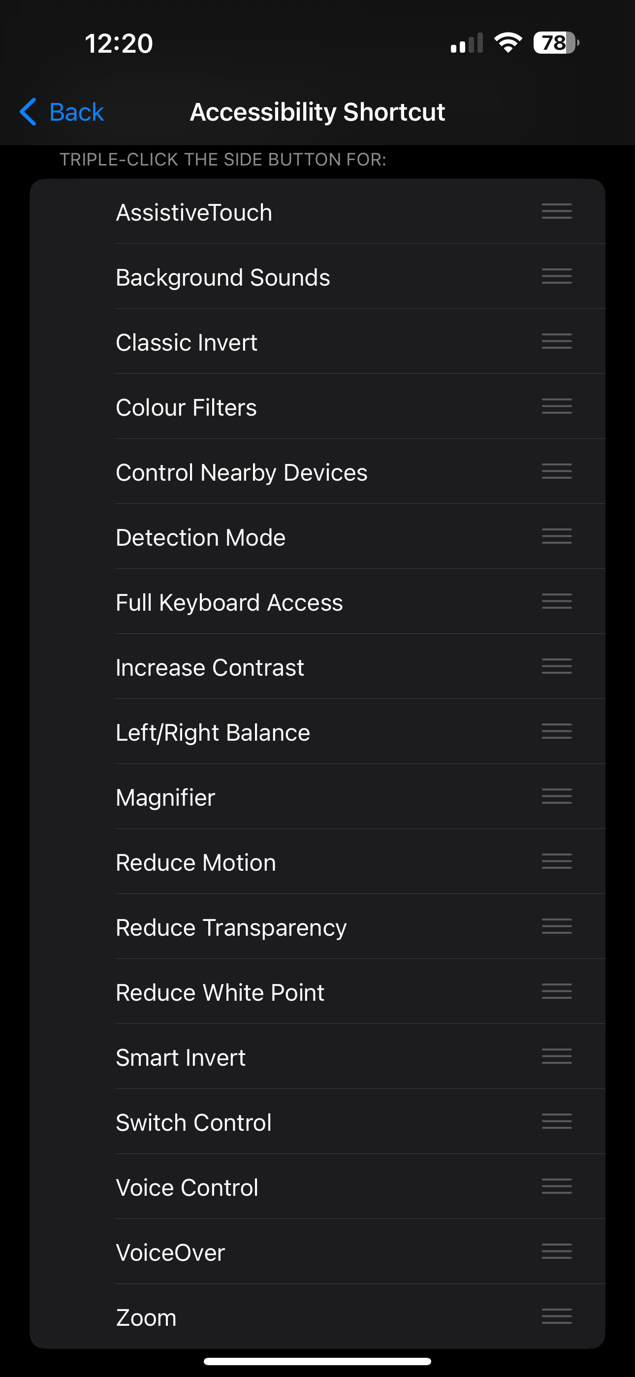
iOS Accessibility Shortcut

I tested a few apps: NHS, Paypal, Coinbase, Trainline, CMC Invest, Lloyds Bank.
I selected these apps because I like their products, I’m an active user, and they were developed and designed by individuals with accessibility in mind.
My goal was to learn from them, rather than to point out what they maybe didn’t well.
Testing device
iPhone 14 Pro Max/ iOS Version:16.5.1(c)- latest version at 03.08.2023
All actionable items and content can be accessed and activated by the following mobile features for iOS  
VoiceOverKeyboard/ Switch/ Zoom/ Reduce Motion/ Invert colours/ Grayscale/ Larger Text/ Voice control/ Dark mode
I decided to present testing results for Dark mode, Larger text, Zoom, Invert Colours, and Grayscale. 
Using Dark Mode has a lot of benefits: reduced eye strain, better visibility in low light, battery savings, focus and concentration, reduced blue light exposure, privacy and discretion. It's important to note that while Dark Mode has its benefits, it might not be the ideal choice for everyone. 
The choice between Dark Mode and Light Mode ultimately comes down to individual preferences and needs.
Dark Mode inverts only the UI, so content such as graphics, images, and app icons remain original.
Because I’m spending most of the time on mobile in a low light I have the Dark Mode enabled all the time. All the testing I did (except Greyscale, Classic, Smart Invert), is on Dark Mode enabled, as you will notice in the images below not all the apps will invert in Dark Mode by default.
How to test
1. Enable Dark Mode
2. Open the app 
3. Is the app in Dark Mode? If not, then it fails this requirement
Two of the six will invert into Dark Mode
Dark Coinbase screen in Dark Mode enabled

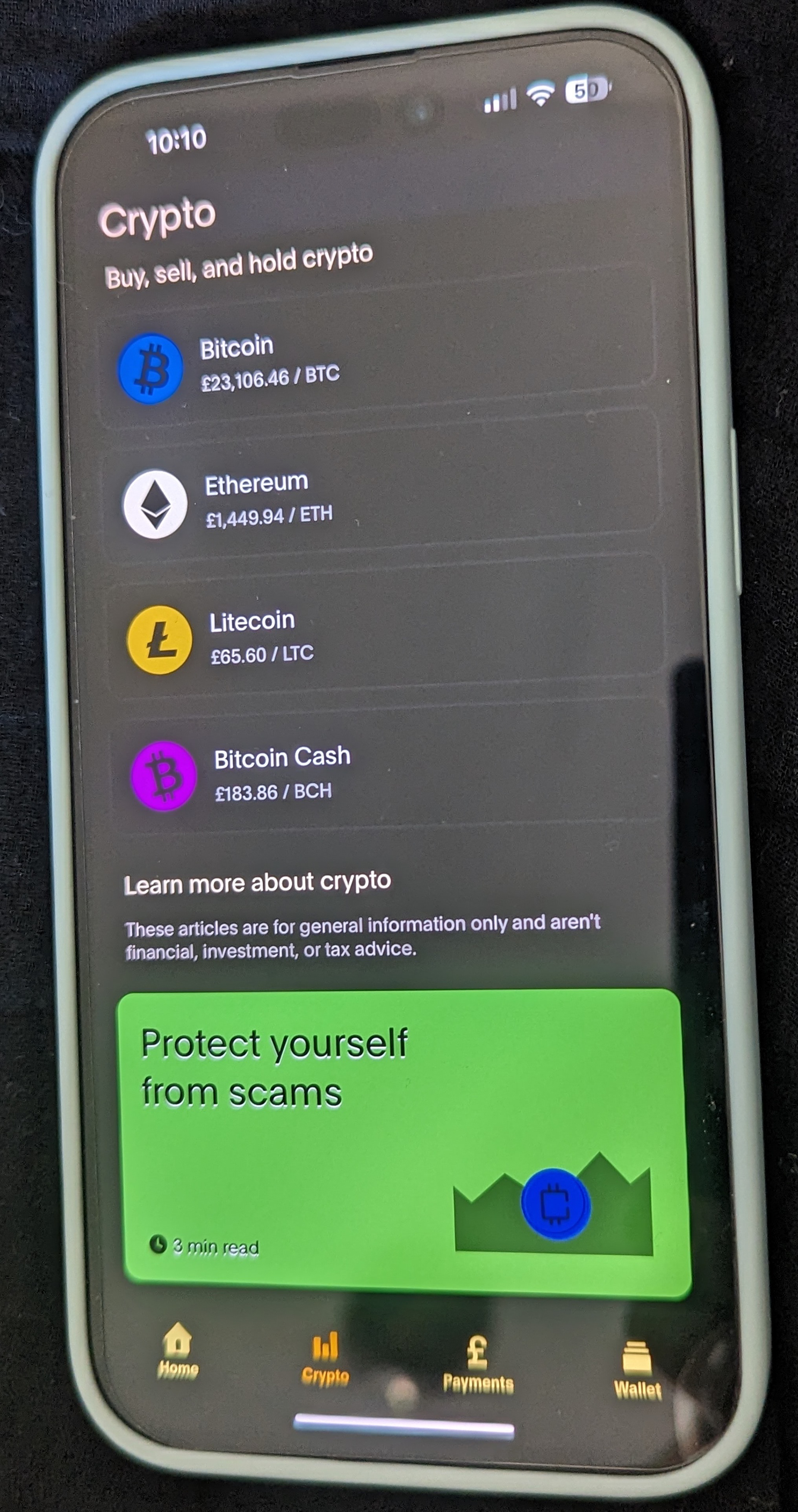
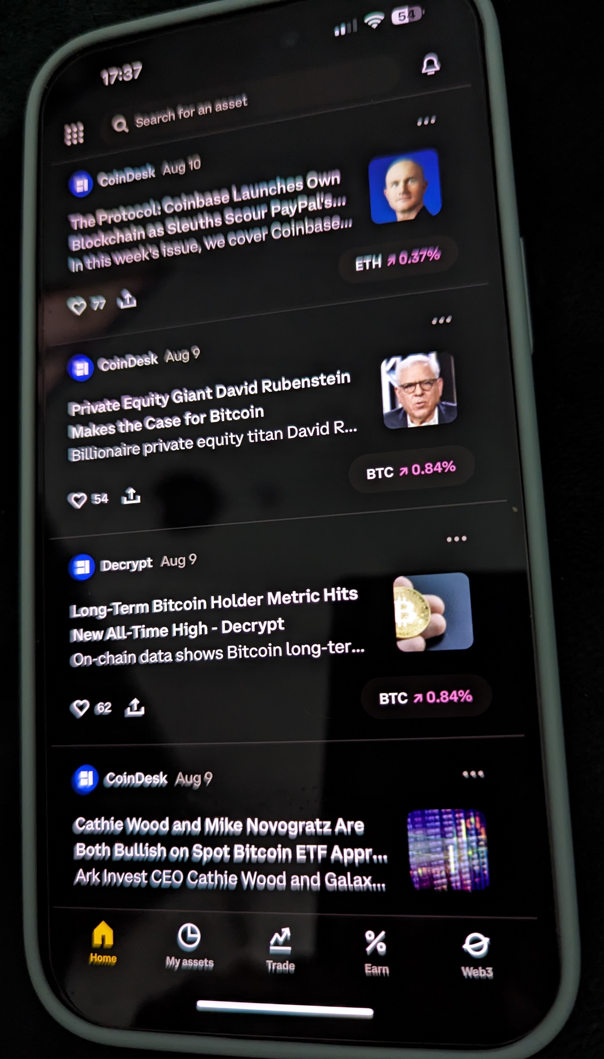
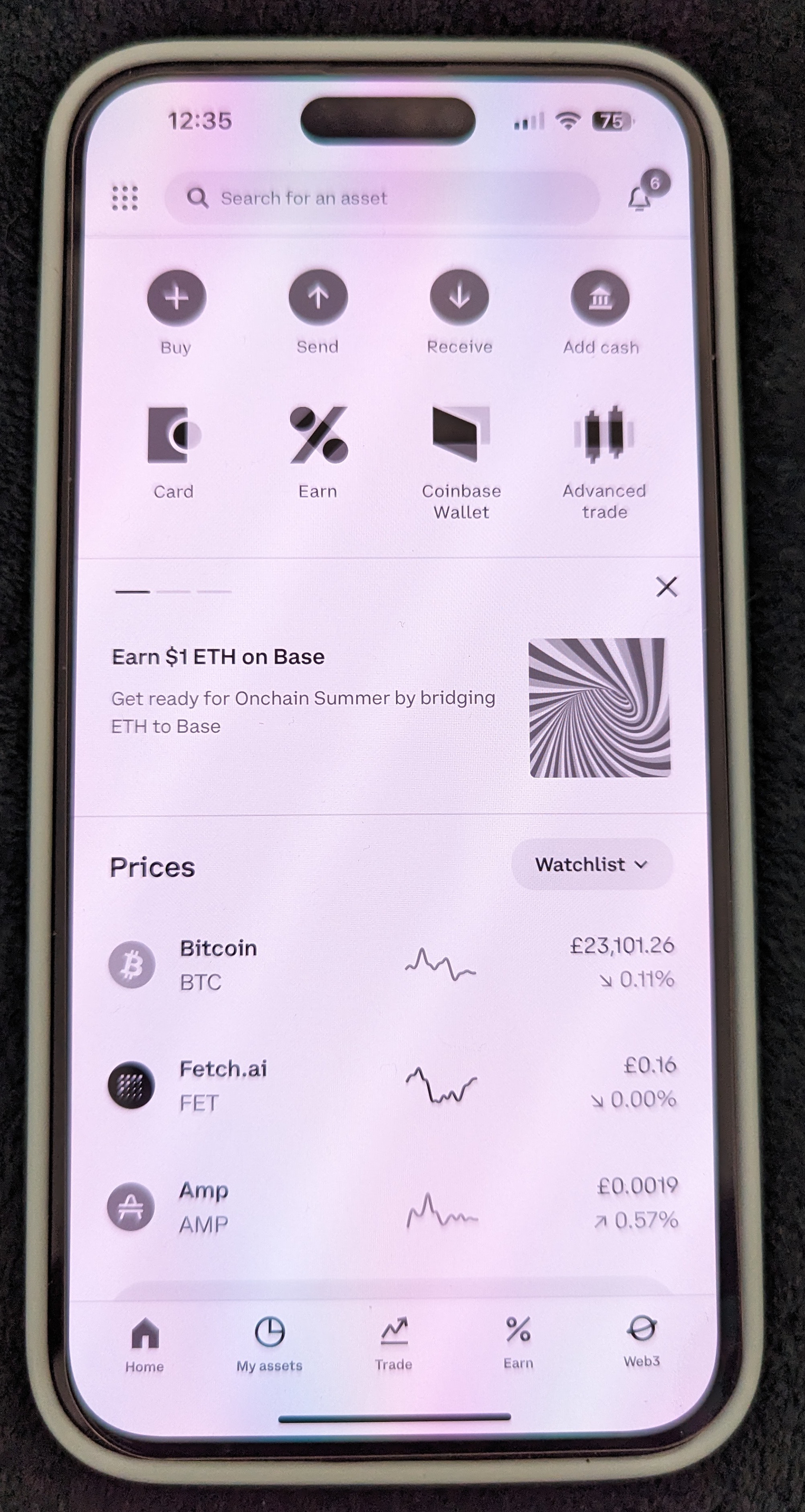
Coinbase Dark Mode enabled

Light Paypal screen in Dark Mode enabled

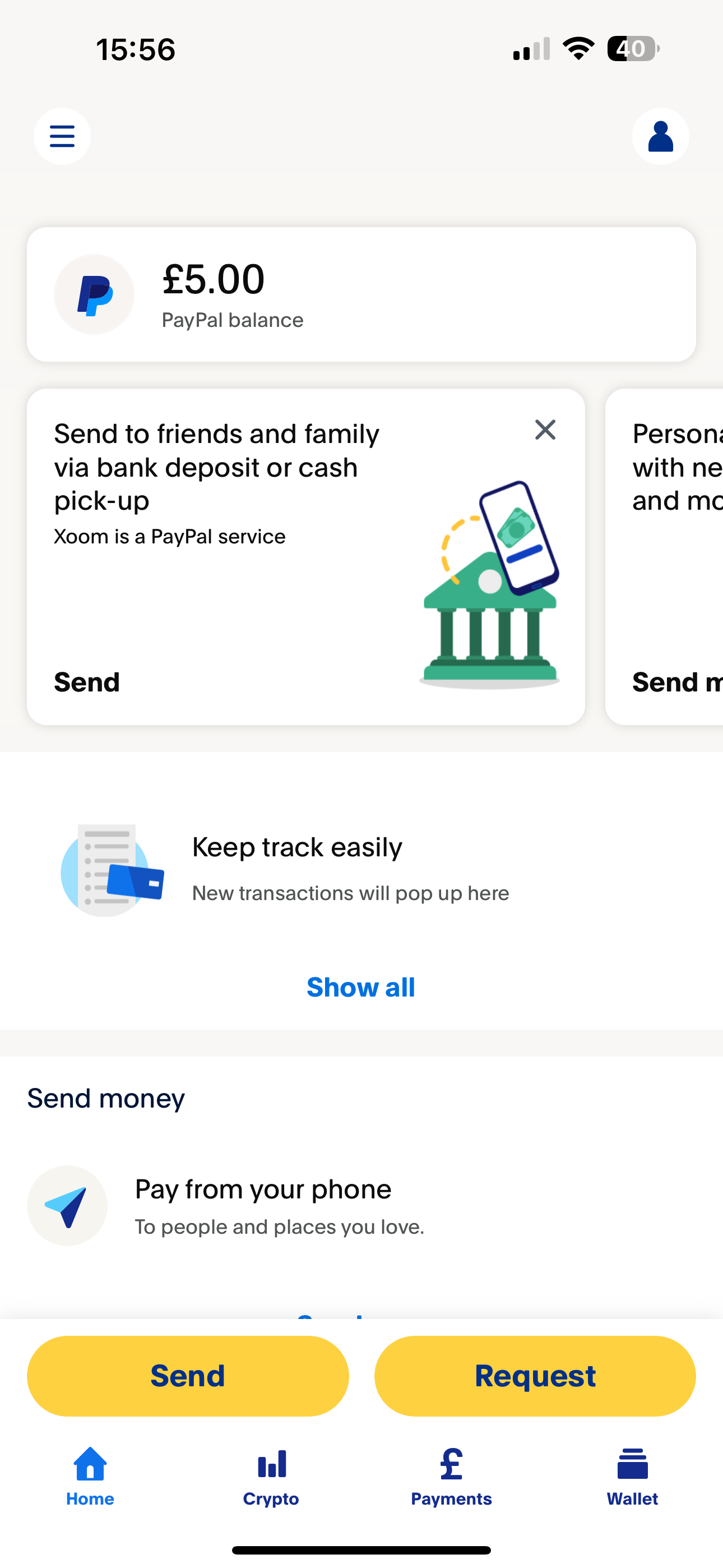
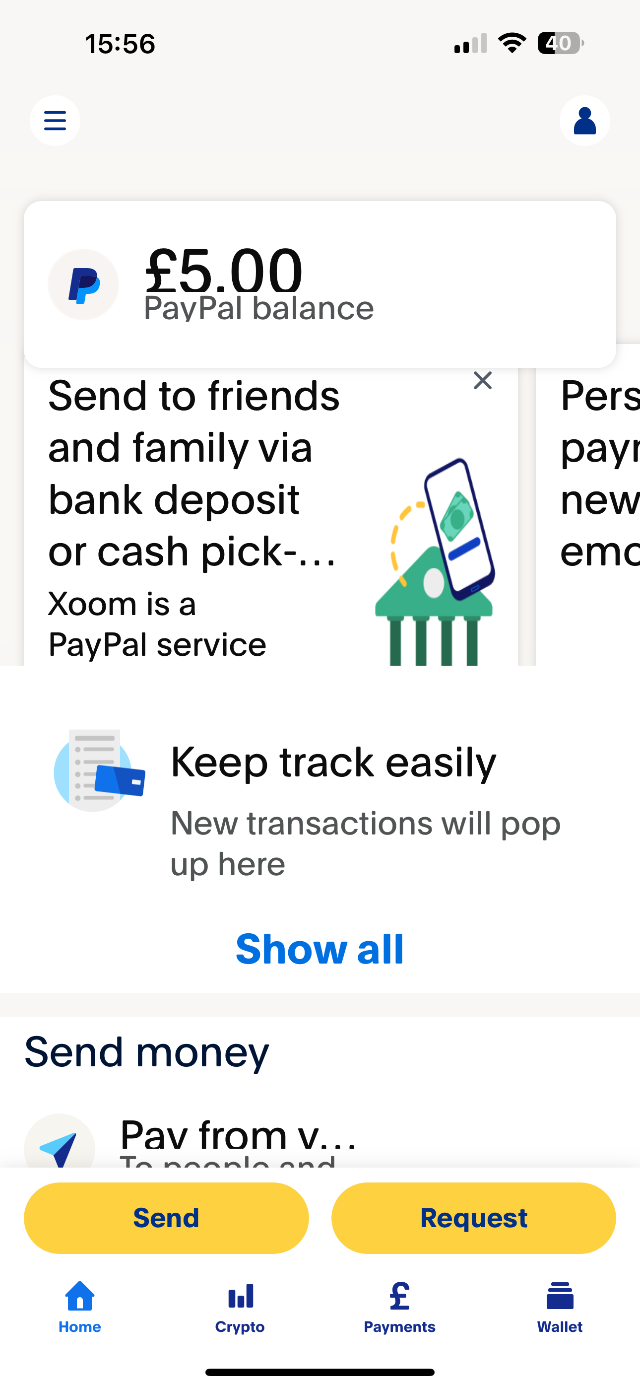
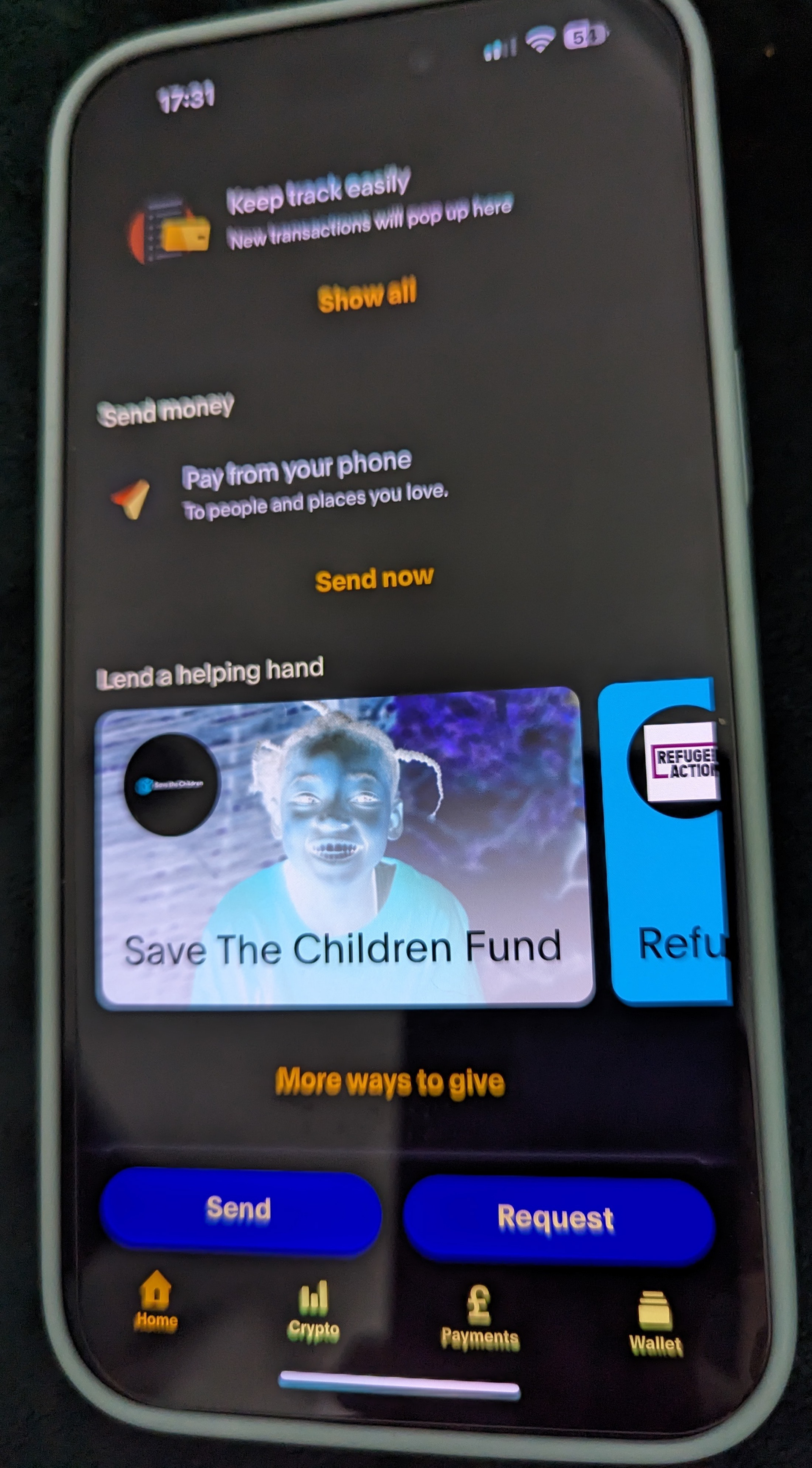
Paypal Dark Mode enabled

Light NHS screen in Dark Mode enabled

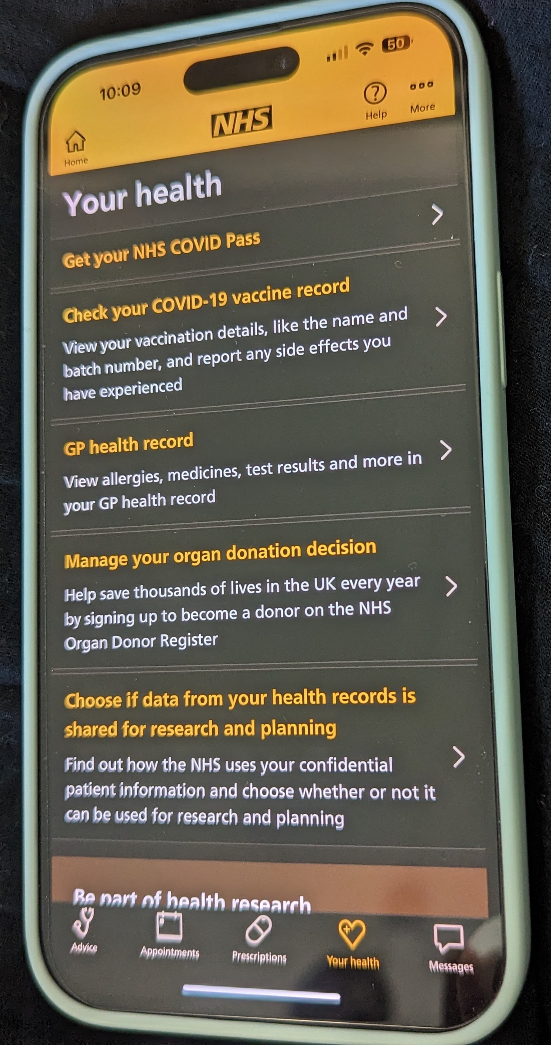
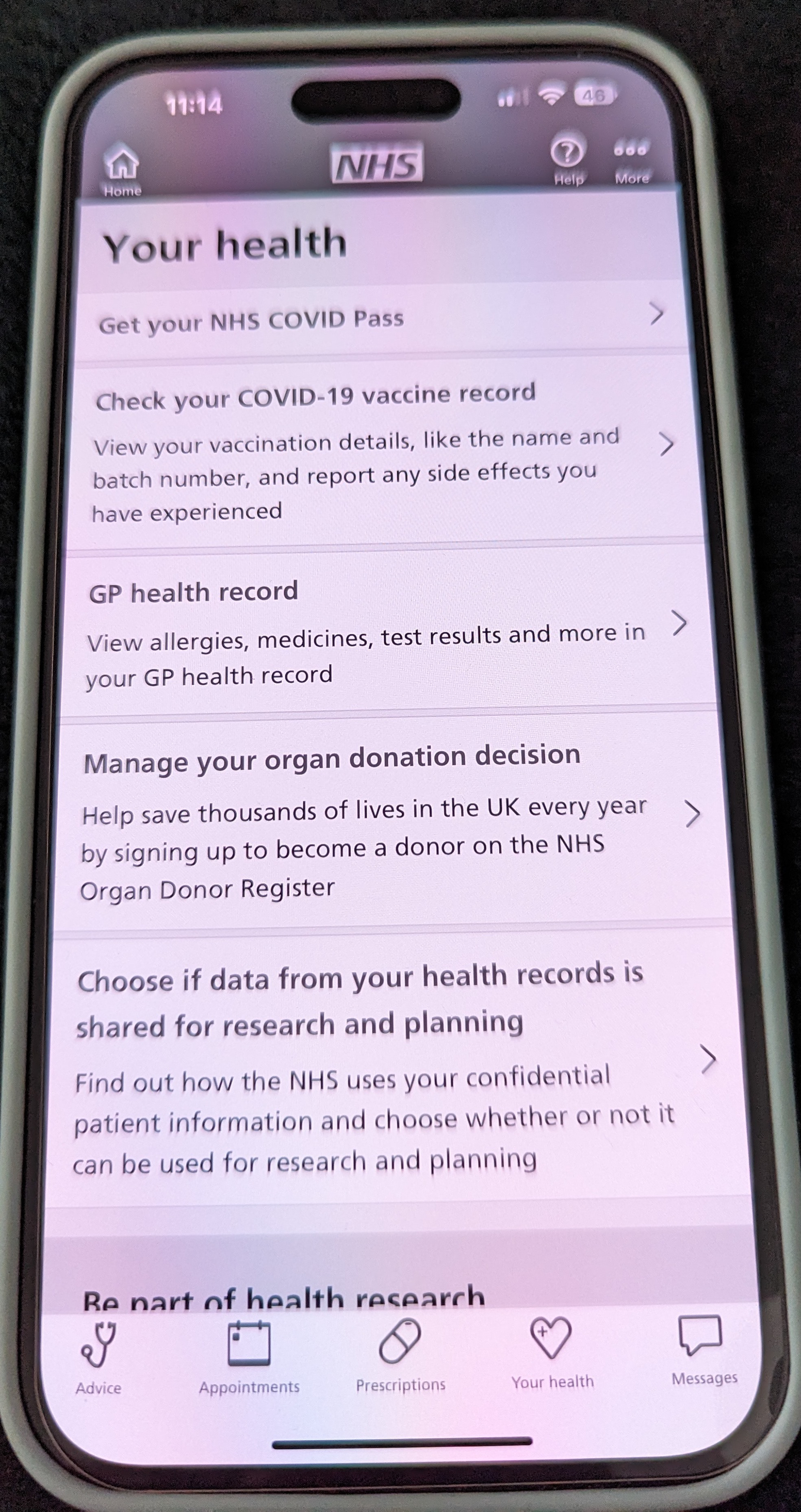
NHS Dark Mode enabled

Light Trainline screen in Dark Mode enabled

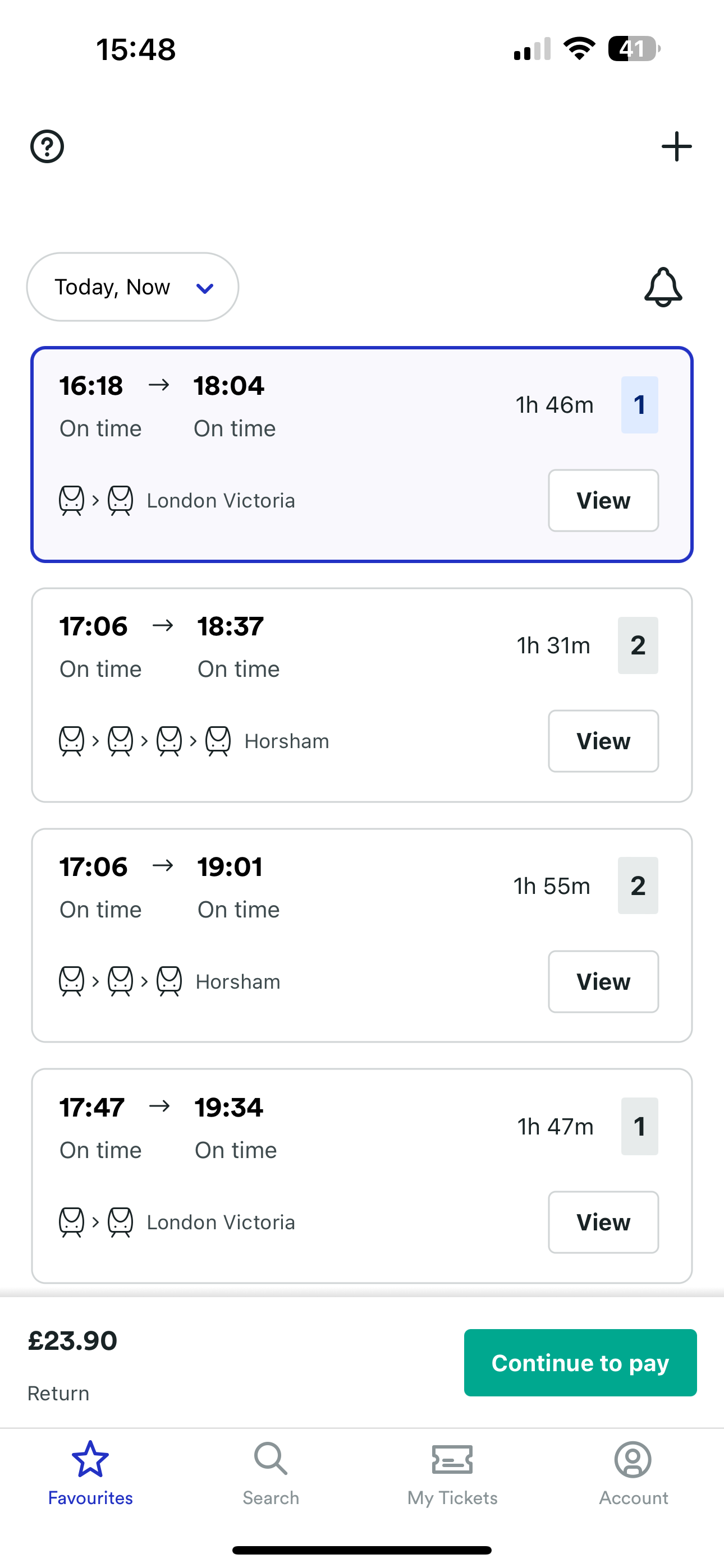
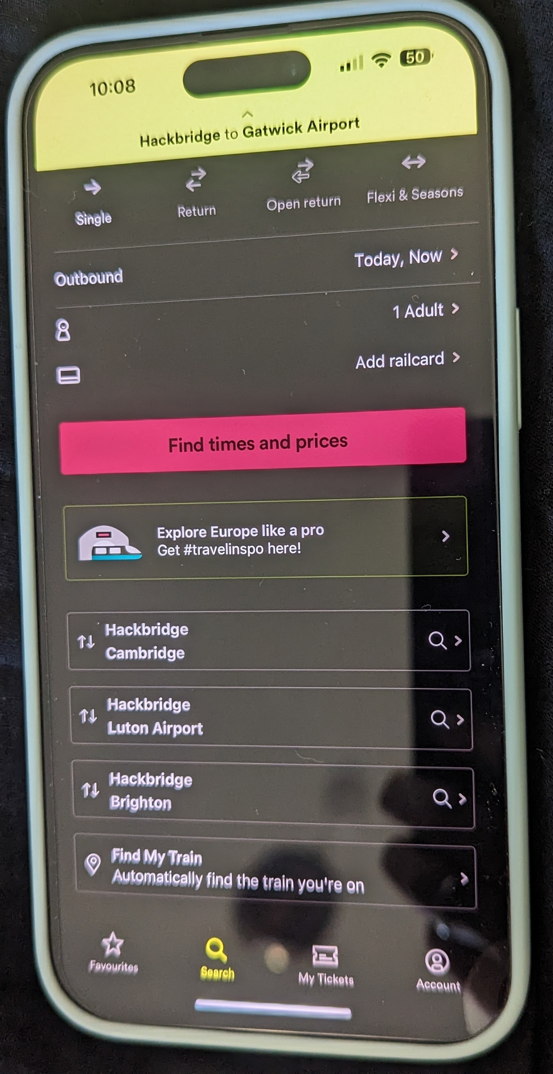
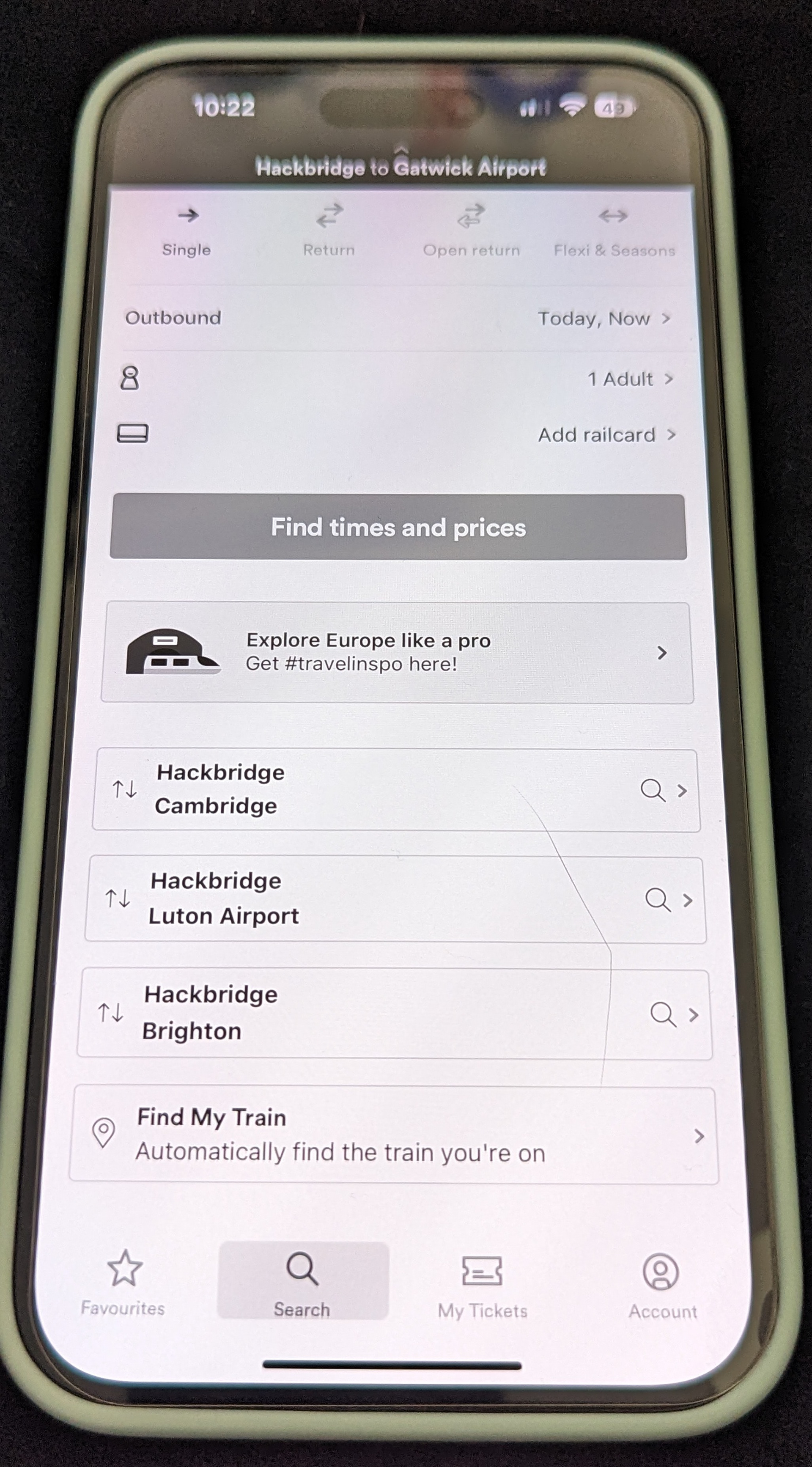
Trainline Dark Mode enabled

Light Lloyds screen in Dark Mode enabled

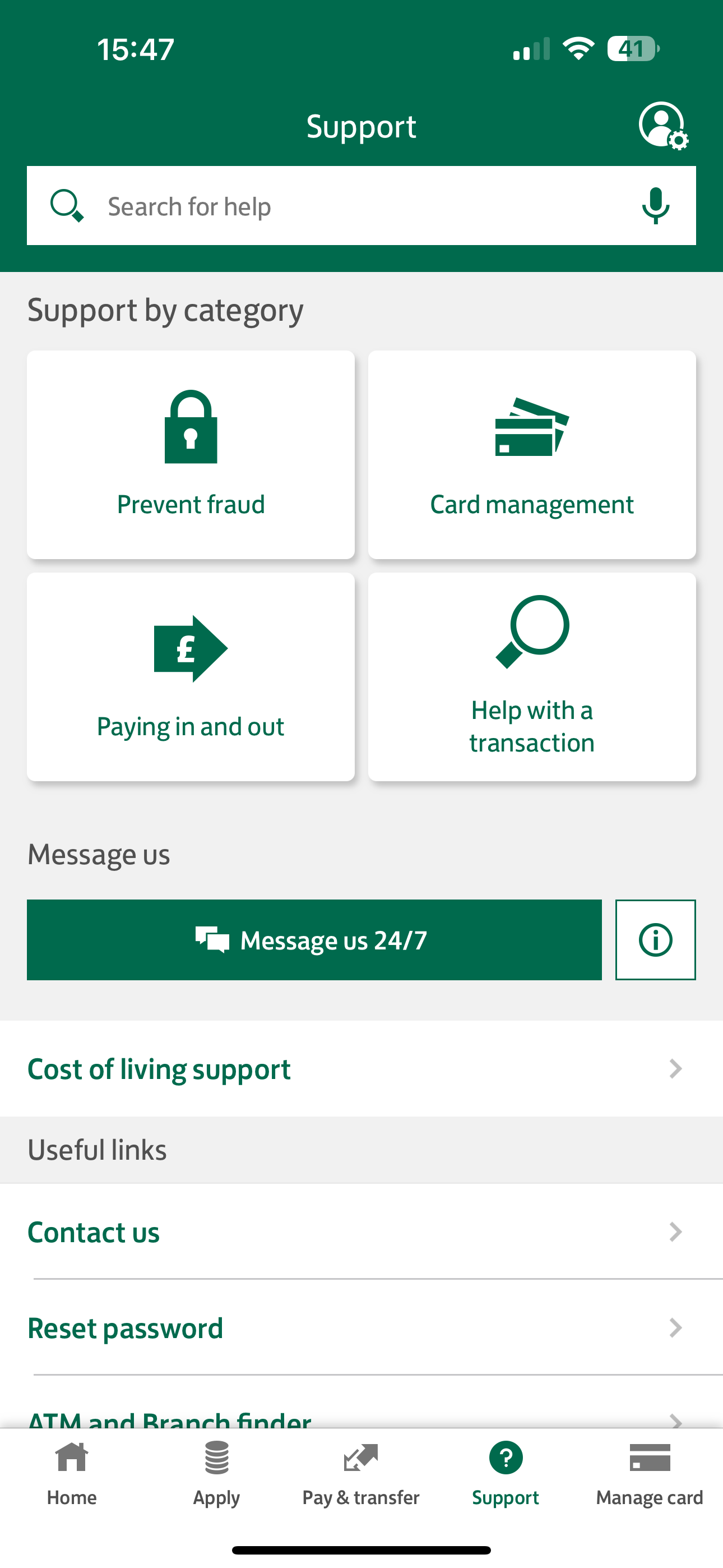
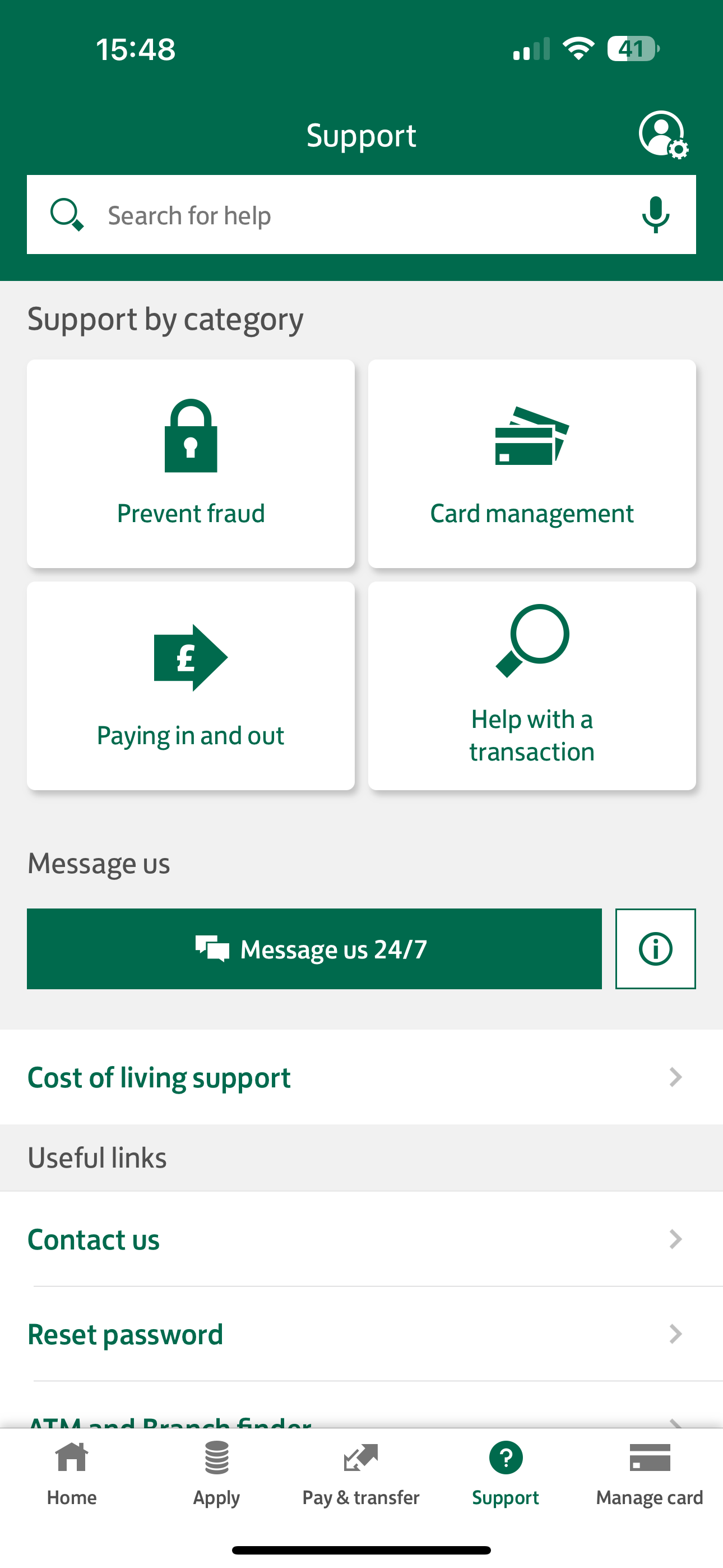
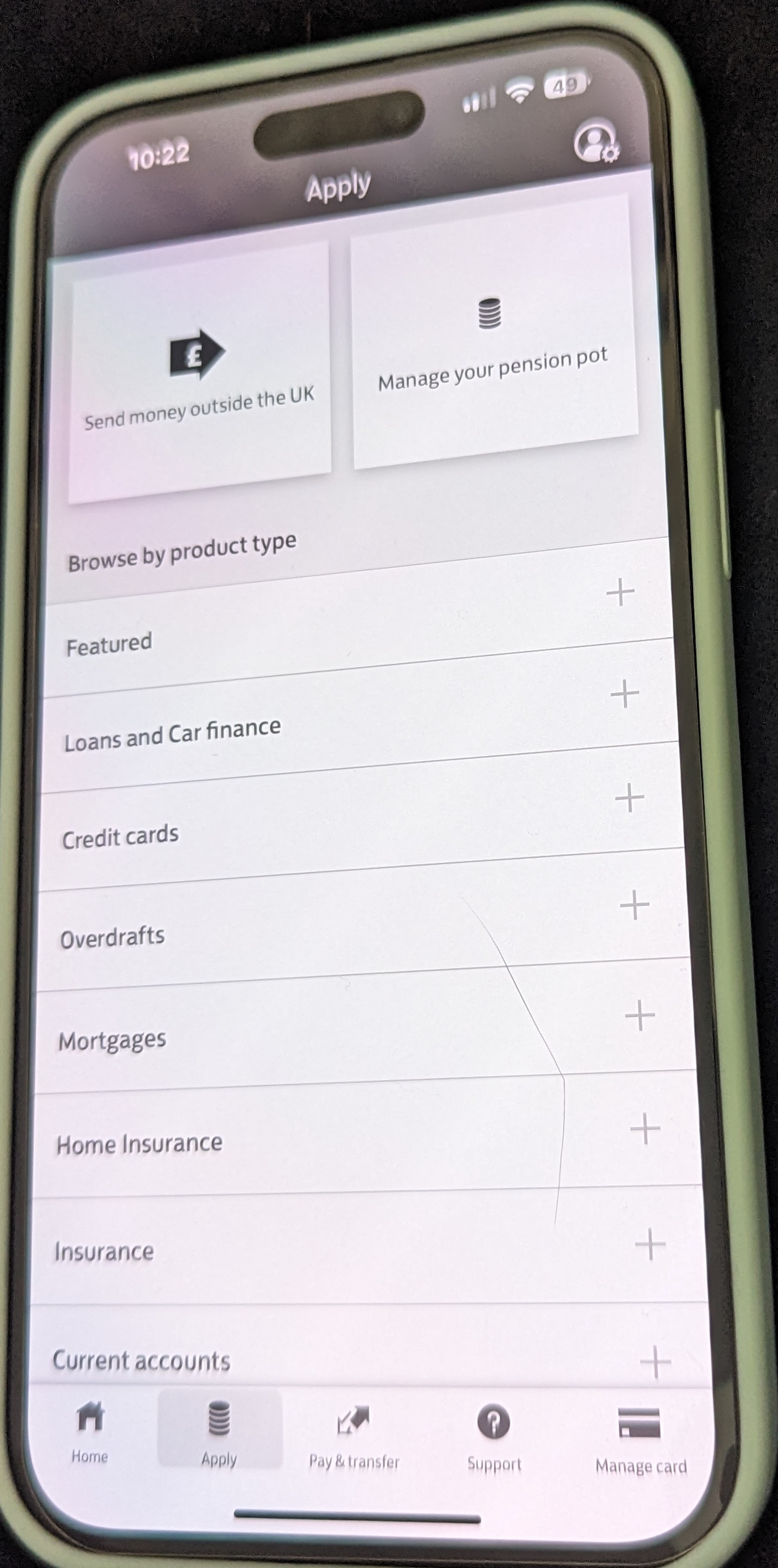
Lloyds Dark Mode enabled

Dark CMC Invest screen in Dark Mode enabled

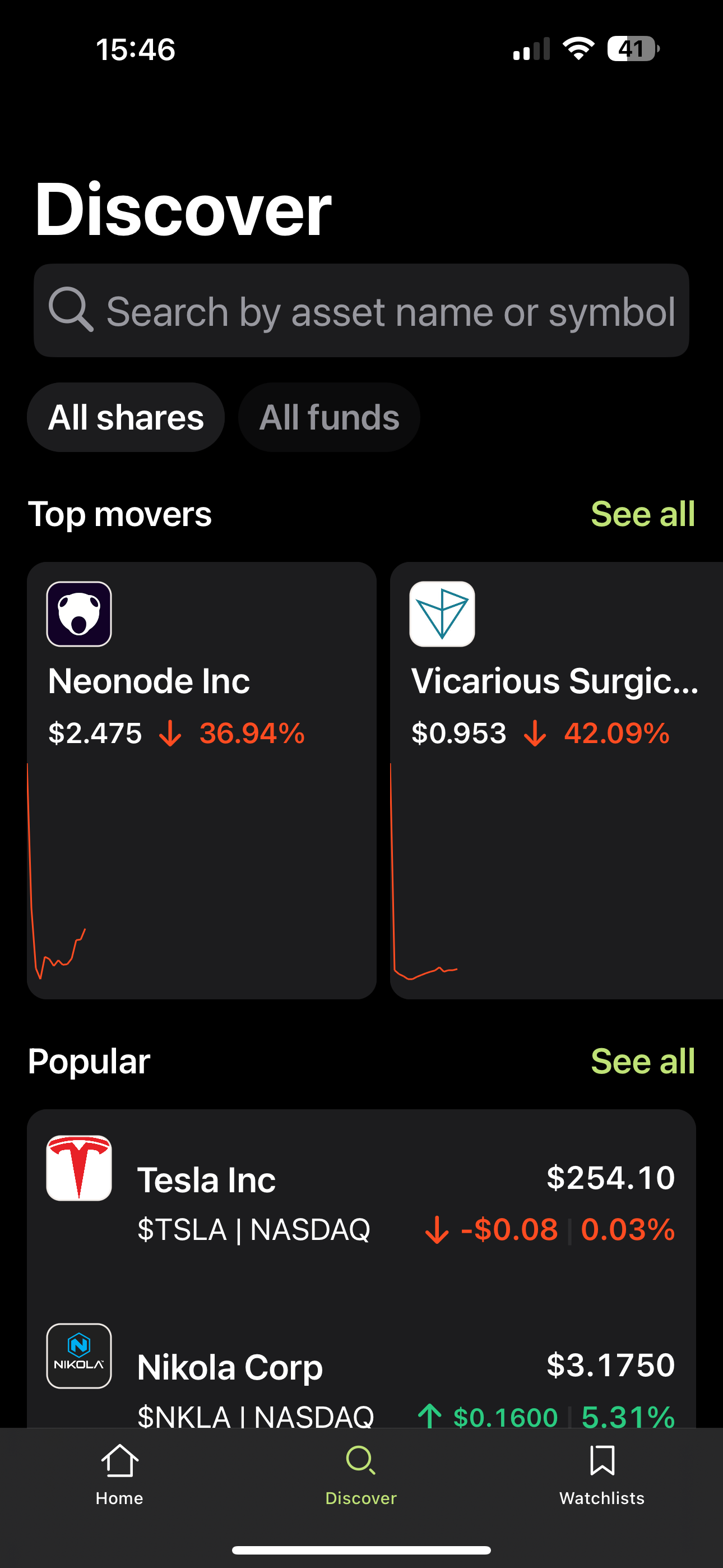
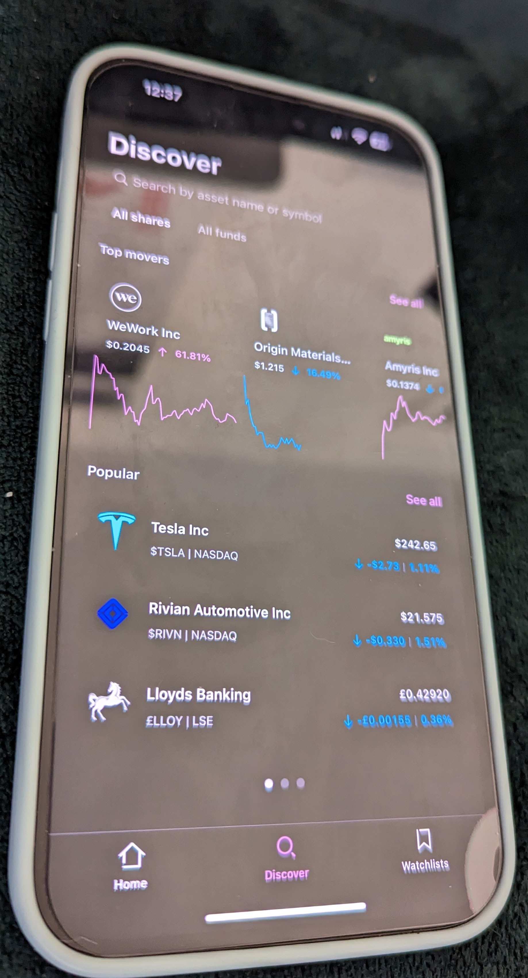
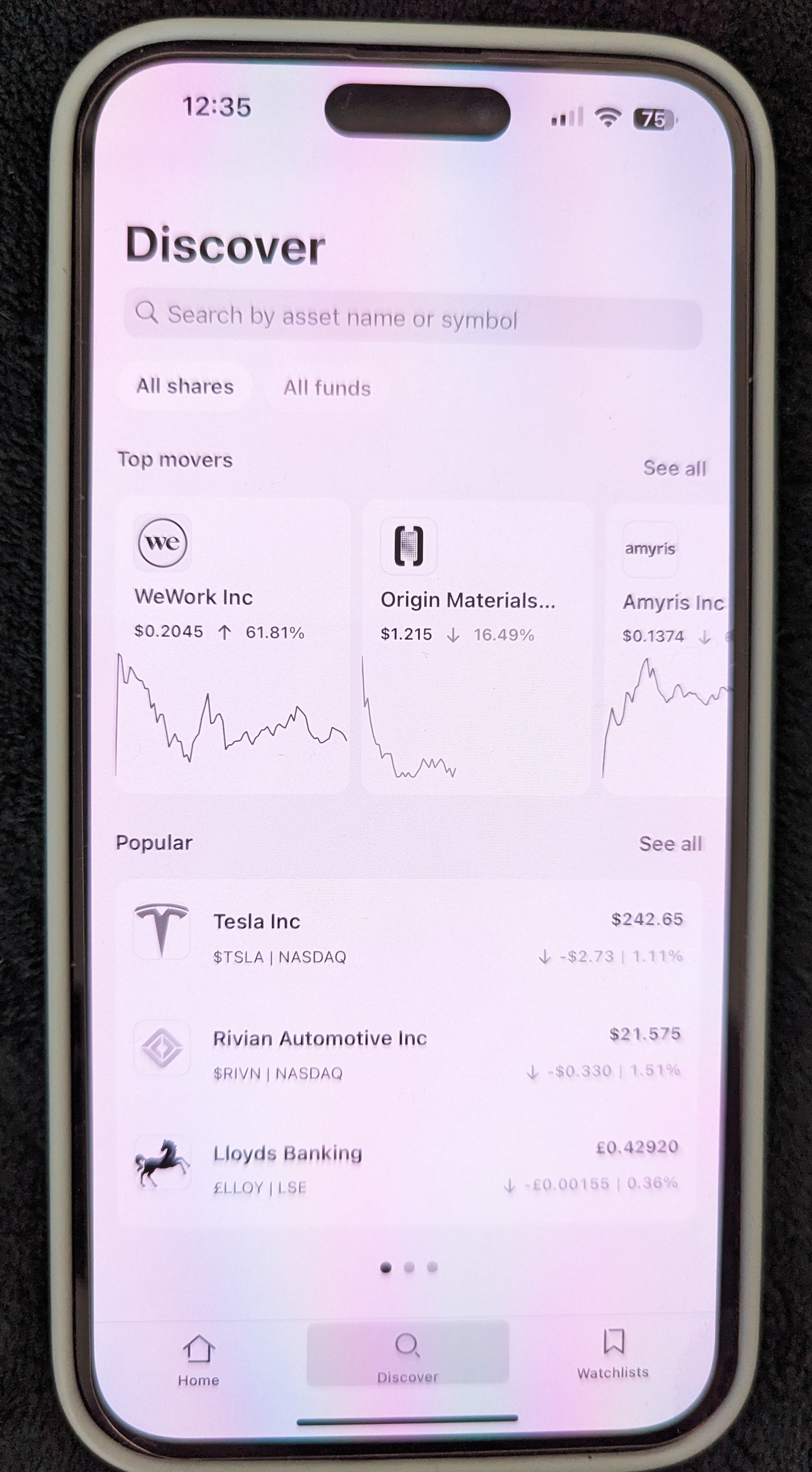
CMC Invest Dark Mode enabled

Enabling Larger Text on iOS can provide several benefits, particularly for people with visual impairments or those who prefer larger text for various reasons. Improved Readability especially for people with visual impairments, such as those with low vision or presbyopia (age-related difficulty focusing on close objects), reduce eye strain, and reduce mistakes.
How to test 
1. Enable Larger Text 
2. Open the app 
3. Questions To Consider 
Does the text properly resize and reflow on the screen? Has the text increased in size? Is all content visible and operational? If the answer is yes, it passes the requirement.
In the NHS app all text increase in size, it's visible and operational

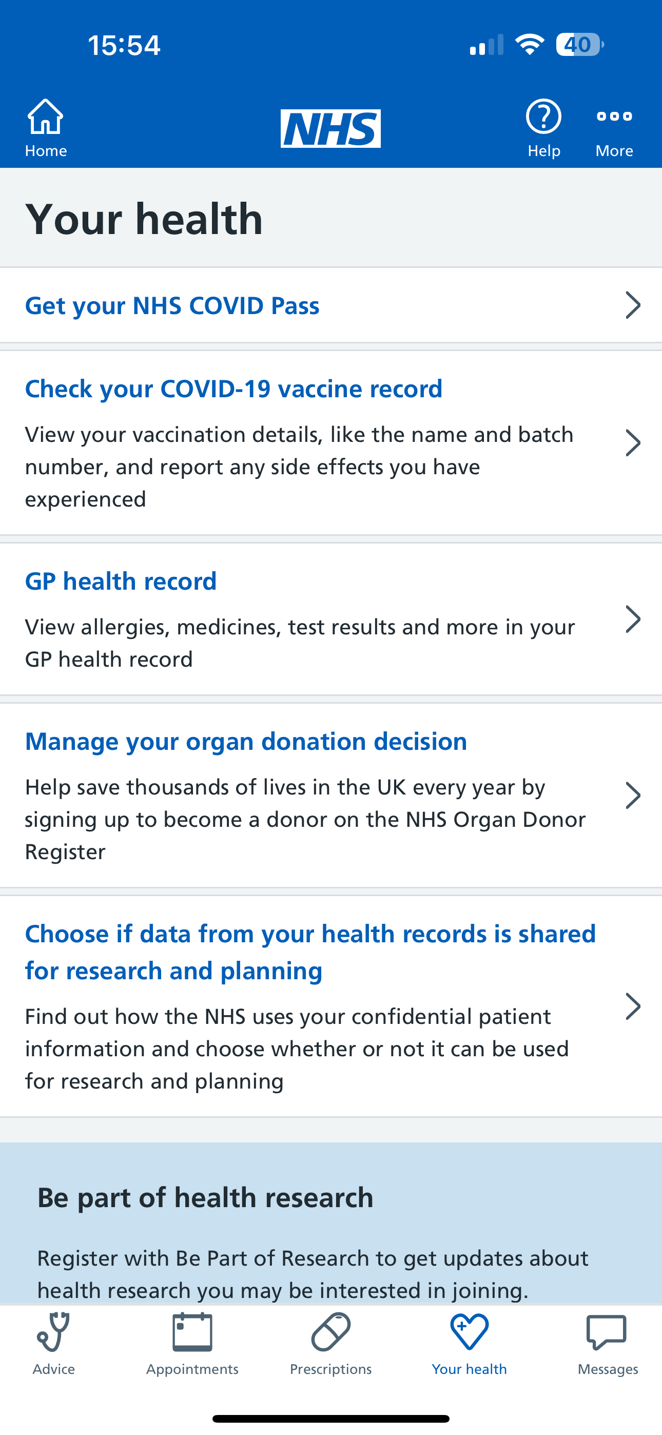
 NHS Larger Text disabled

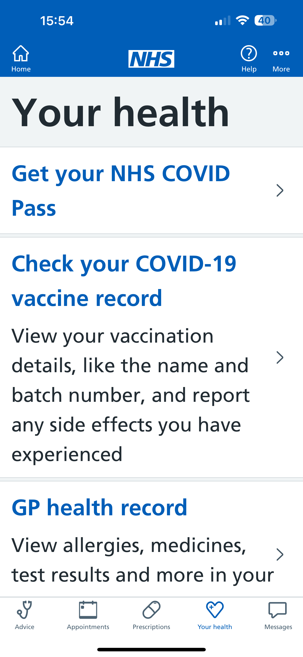
NHS Larger Text enabled

In the Paypal app not all text increase in size, the call to action text buttons 'Send' and 'Request' remain in the initial size, however, some of the UI breaks and it could be improved.

 Paypal Larger Text disabled

Paypal Larger Text enabled

In the Coinbase app all text increase in size, it's visible and operational. The label for 'Coinbase Wallet' and 'Advanced trade' could probably be re-aligned without breaking the word.

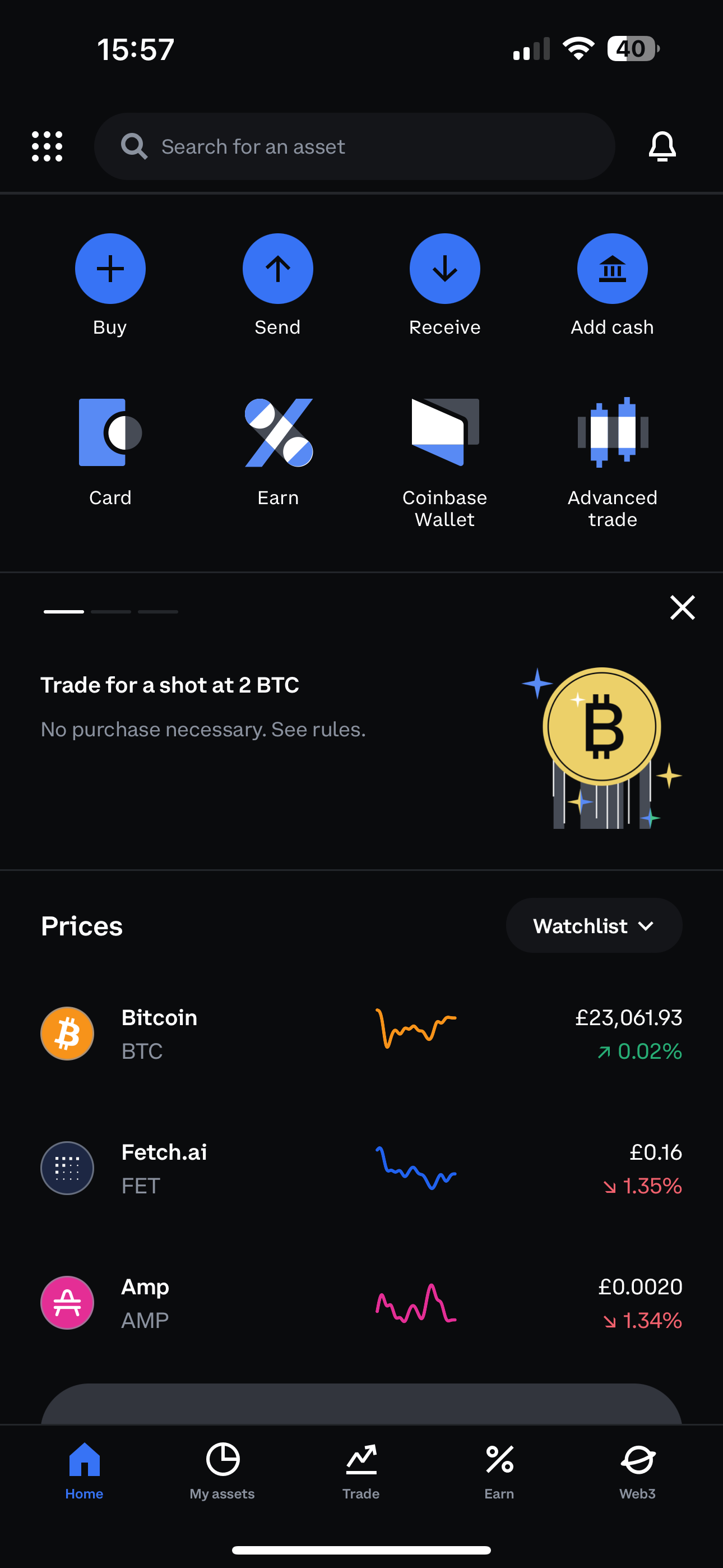
 Coinbase Larger Text disabled

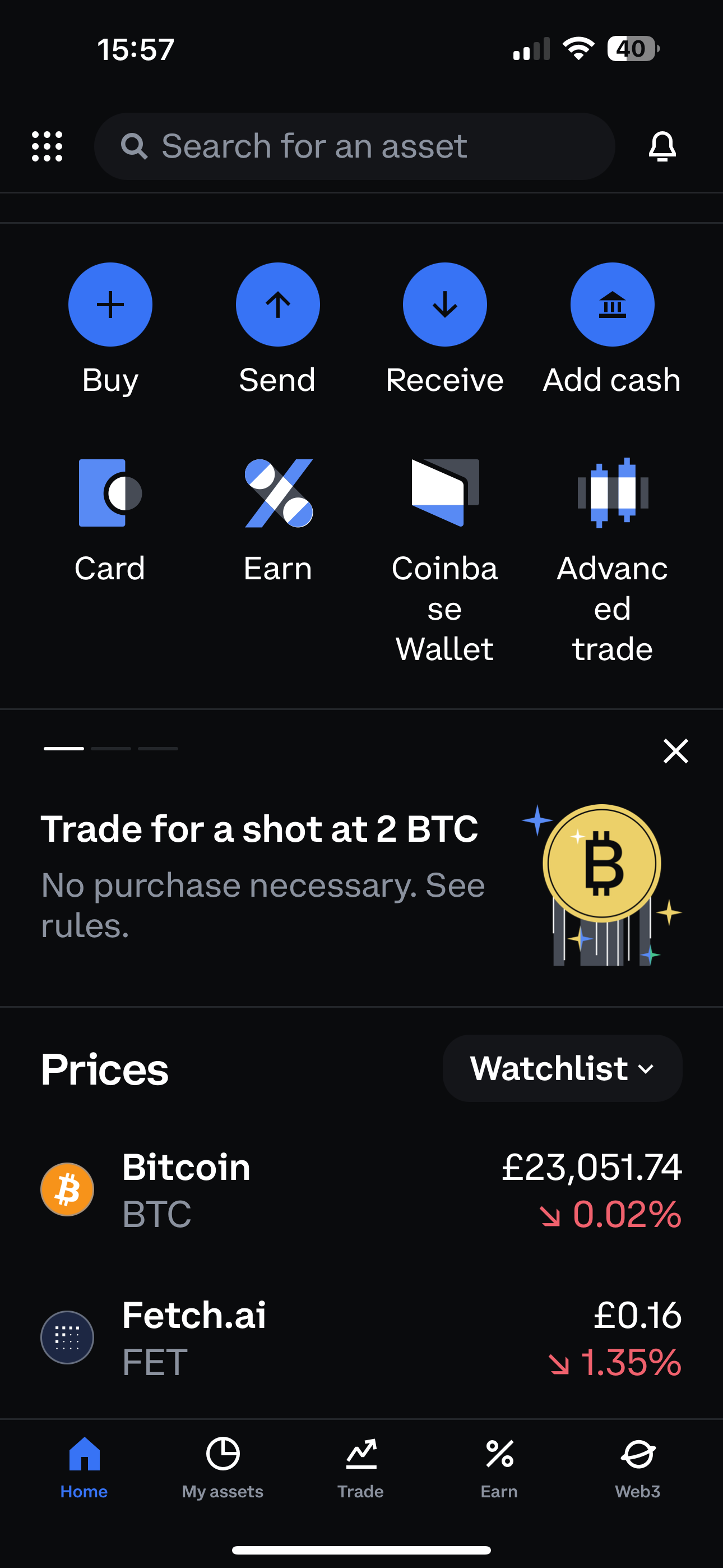
Coinbase Larger Text enabled

In the Trainline app all text increase in size, it's visible and operational

 Trainline Larger Text disabled

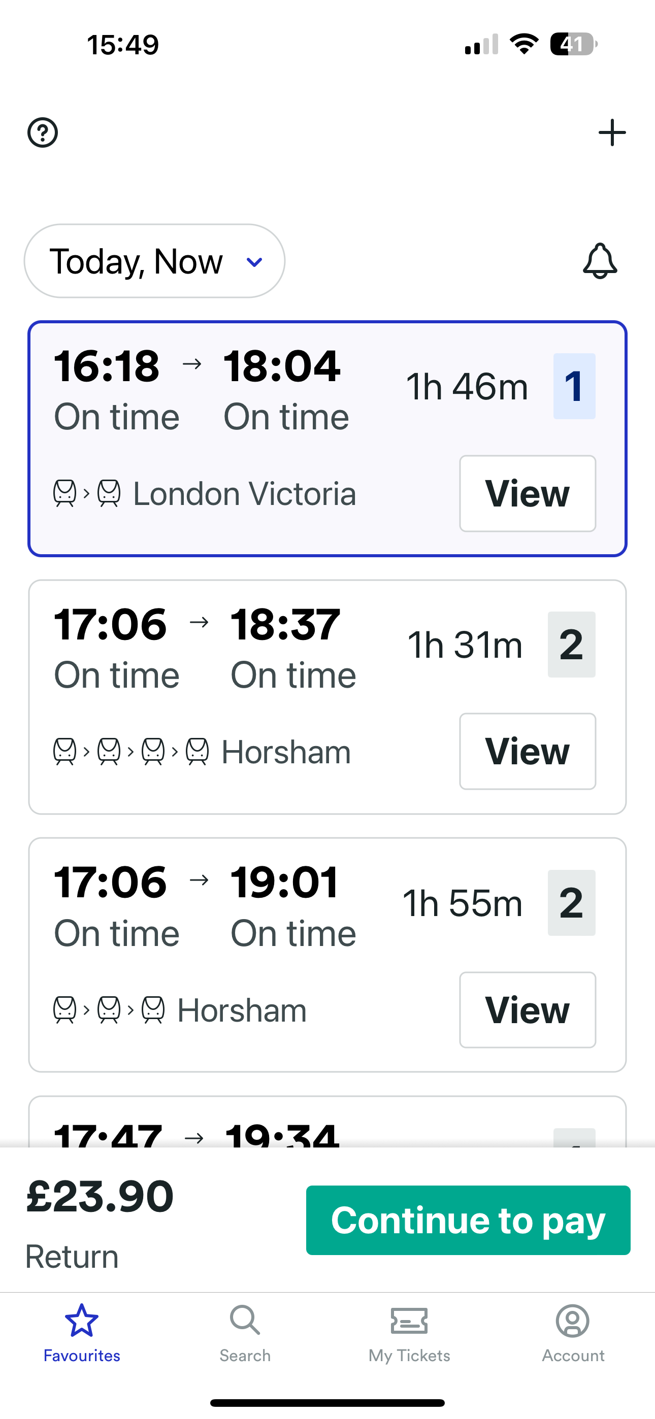
Trainline Larger Text enabled

In the CMC Invest app all text increase in size, it's visible and operational

CMC Invest Larger Text disabled

CMC Invest Larger Text enabled

In the Lloyds app, all text remains the same

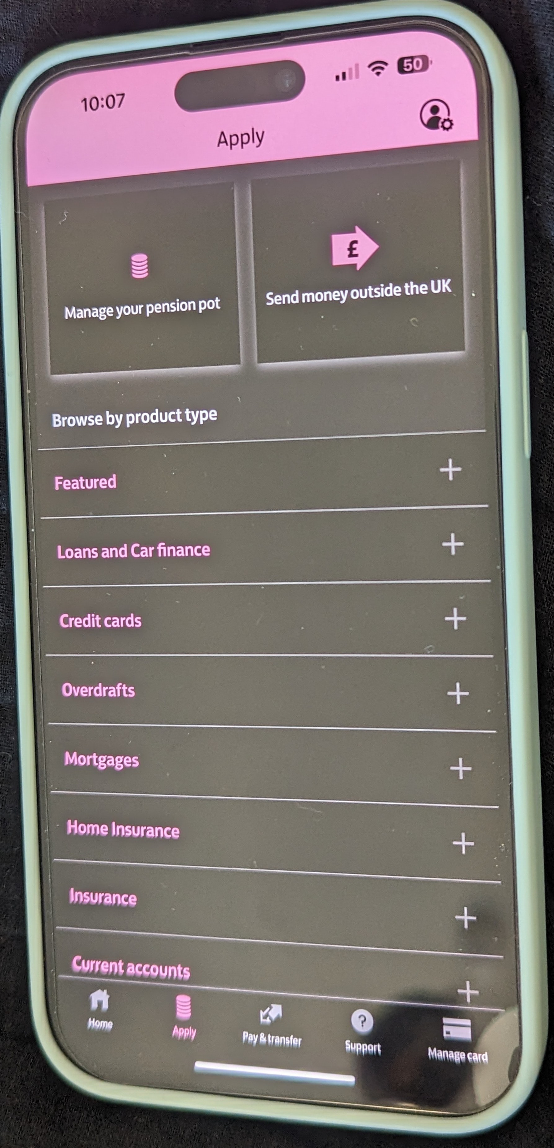
 Lloyds Larger Text disabled

Lloyds Larger Text enabled

Zoom can help people with low vision or those who require assistance to read and interact with content on their devices, but also people with cognitive impairments like autism or attention deficit disorder concentrate on important information and lessen the amount of visual noise on the screen. Using Zoom can contribute to overall comfort and health by reducing eye strain, headaches, etc.
Zoom enabled on iOS magnify the screen no matter what you're doing. You can magnify the entire screen (Full-Screen Zoom) or magnify only part of the screen with a resizable lens (Window Zoom). And, you can use Zoom together with VoiceOver.
How to test 
1. Enable Zoom
2. Select a region 
3. Select a zoom magnification. 
4. Use the slider to control the zoom level
5. Determine that you can move around the screen and access all content and functionality
6. Questions To Consider 
Is it possible to enlarge the text on the app by at least 200%? Is the screen visible when the entire view is enlarged with Invert Colours and Greyscale enabled? Does it work with Voice Over enabled? Does the app function in ‘window zoom’ or ‘full-screen zoom'?
All the apps function in 'Window Zoom' or 'Full-Screen Zoom
From the left size to right Lloyds in light screen, CMC Invest in dark screen, NHS in light screen, Paypal in light screen, Coinbase in dark screen and Trainline in light screen in 'Window Zoom'

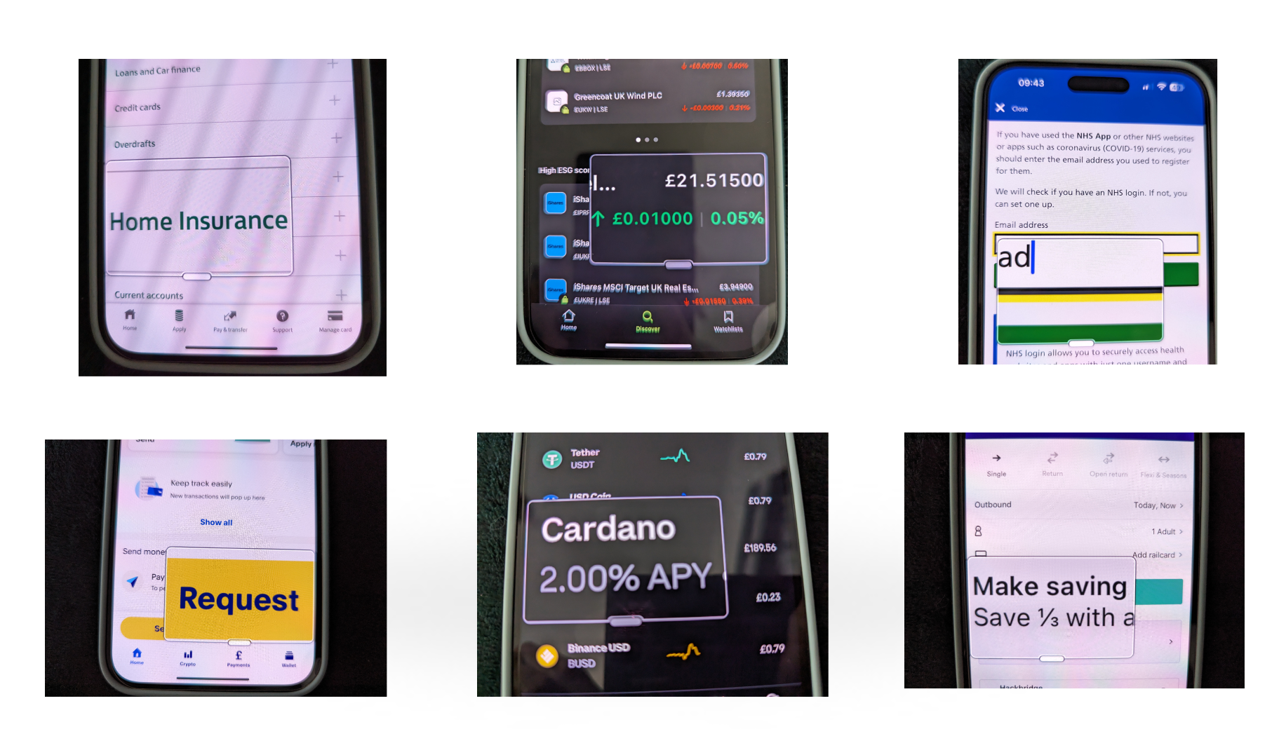
From the left size to right Lloyds, CMC Invest, NHS, Paypal, Coinbase and Trainline apps in 'Window Zoom'

All actionable items and content can be accessed and activated with Invert Colours enabled on iOS.
Invert Colours can be used with VoiceOver, Grayscale and Zoom.
Classic Invert reverses the colours of the display. Provide benefits for people with visual impairments or sensitivities to certain colour combinations. Classic Invert creates a high-contrast, negative colour effect. Some benefits are enhanced contrast, reduced glare, enhanced focus, and reduced eye strain. However, it's important to note that Classic Invert is different from Smart Invert. 
How to test 
1. Open the app. 
2. Activate Classic Invert
3. Questions to consider
Does the entire screen invert by using Classic Invert? Is the contrast between the foreground and background sufficient for important content and actionable items? Ensure that no important content or actionable items use colour as critical to their meaning.
Lloyds dark screen on Classic Invert enabled

Lloyds Classic Invert enabled

Trainline dark screen on Classic Invert enabled

Trainline Classic Invert enabled

NHS dark screen on Classic Invert enabled

NHS Classic Invert enabled

Paypal dark screen on Classic Invert enabled

Paypal Classic Invert enabled

Coinbase Classic Invert enabled

CMC Invest dark screen on Classic Invert enabled

CMC Invest Classic Invert enabled

Smart Invert inverts the colours of the interface while preserving the original colours of images and other content. This means that text remains legible and images remain recognisable, while the background becomes darker, reducing eye strain and improving contrast.
How to test 
1. Open the app. 
2. Activate Smart Invert
3. Questions to consider
Does the page show inverted colours, except for images, videos, camera access and dark backgrounds?
In the images below Paypal on Smart Invert enabled inverted also the images and Coinbase inverted colours but not the images.
Paypal dark screen on Smart Invert enabled

Paypal Smart Invert enabled

Coinbase dark screen on Classic Invert enabled

Coinbase Smart Invert enabled

Grayscale will invert colours in black & white. Enabling the grayscale offers a unique set of benefits, mainly centred around reducing distractions, promoting mindfulness, and potentially aiding in breaking smartphone addiction by making the screen less appealing. It can be helpful for individuals with certain types of colour vision deficiencies or colour blindness.
All actionable items and content can be accessed and activated with Grayscale enabled on iOS
How to test 
1. Open the app
2. Activate Grayscale
Questions To Consider
Is there enough contrast between the foreground and background to distinguish important information and take-action items? Ensure that no important content or actionable items use colour as critical to their meaning.​​​​​​​
Utilising filled icons for the pressed state for the toolbar would help the user to navigate smoothly and provide a better experience.
Black and white Lloyds screen in Greyscale enabled

Lloyds Grayscale enabled

Black and white Trainline screen in Grayscale enabled

Trainline Grayscale enabled

Black and white Paypal screen in Greyscale enabled

Paypal Grayscale enabled

Black and white NHS screen in Greyscale enabled

NHS Grayscale enabled

Black and white Coinbase screen in Greyscale enabled

Coinbase Grayscale enabled

Black and white CMC Invest screen in Greyscale enabled

CMC Invest Grayscale enabled

In conclusion, the apps I tested demonstrated a commendable dedication to accessibility, aligning well with the device's designed accessibility features for the most part. This is a significant achievement that ensures inclusivity and usability for a wider range of users, including those with disabilities.
As someone new to the field of digital accessibility and having pursued a self-taught approach, I am eager to learn and improve. If there are any areas in which I may have fallen short during my recent accessibility testing of mobile apps, I would be extremely grateful for the insights of accessibility professionals, product designers, developers, and others. 
Your valuable feedback is crucial in helping me grasp industry best practices, refine my testing methodologies, and elevate my skill set. By receiving constructive input, I am committed to making sure I positively impact the development of more inclusive and accessible digital experiences.
Back to Top