PROJECT OVERVIEW
This is a project I created as a part of Google Professional UX Certification from the desire to learn new software (Adobe XD) and also to improve my knowledge about responsive websites. It was challenging because of the financial industry which I find restrictive.
The product
New Bank is an online bank that offers all the services online. The typical user is between 25- 50 years old, and most are busy professionals. New Bank's goal is to make a bank account easy and fast for all users, no matter the devices are they using.

Project duration
September 2021- November 2021
Tool
Adobe Xd

The problem
Available online bank websites have too many steps to do and confusing navigation.

The goal
Design a bank website to be user friendly by offering a fast creating account process.

My role
UX designer leading the New Bank website design.

My responsibilities
Conducting interviews, paper and digital wireframing, low and high-fidelity prototyping, conducting usability studies, accounting for accessibility, iterating on designs and responsive design.
UNDERSTANDING THE USER

User Research: summary
I conducted user interviews, which I then turned into empathy maps to better understand the target user and their needs. I discovered that many target users treat online banks as an easy and faster way to find what they need. However, many banks' websites are overwhelming and confusing to navigate, which frustrated many target users. This caused a normally enjoyable experience to become challenging for them, defeating the purposes of faster and easy.
User Research: pain points

Navigation
Banks website designs are often busy, which results in confusing navigation.

Interaction
Too many clicks and steps make users make mistakes.

Experience
Online bank websites don’t provide an engaging browsing experience.
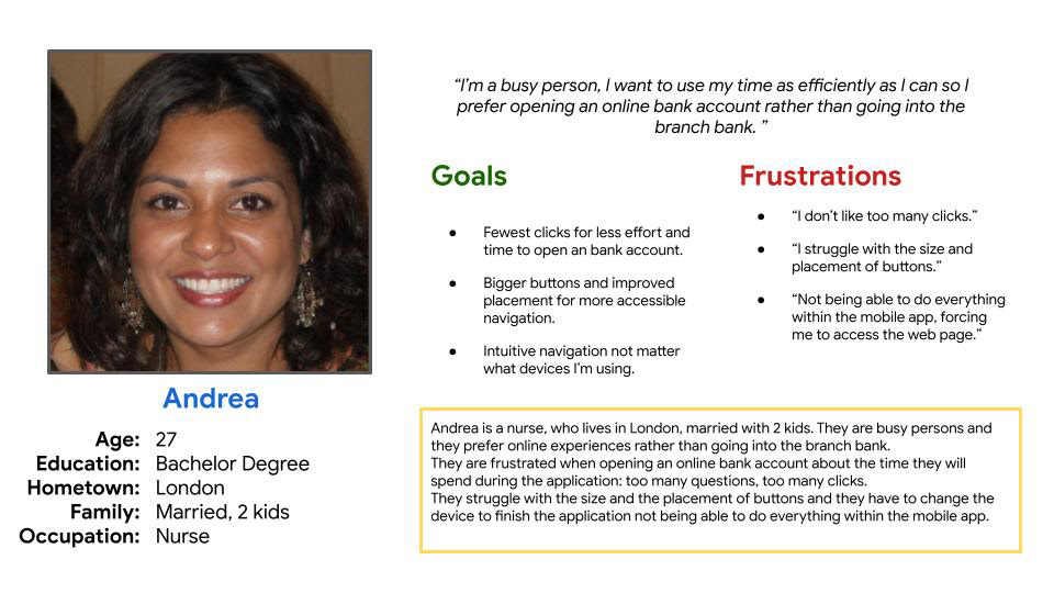
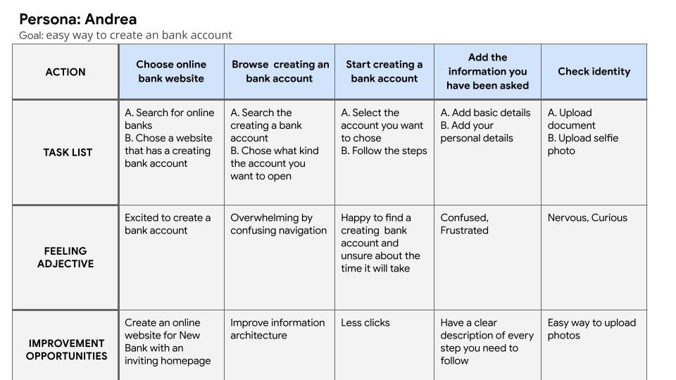
Persona: Andrea
Problem statment
Andrea is a busy nurse and mom who needs intuitive website navigation and less clicks because they want to create a bank account to be stress - free.
User journey map
I created a user journey map of Andrea’s experience using the site to help identify possible pain points and improvement opportunities.
STARTING THE DESIGN
Site map
Difficulty with website navigation was a primary pain point for users, so I used that knowledge to create a sitemap.
My goal here was to make strategic information architecture decisions that would improve overall website navigation. The structure I chose was designed to make things simple and easy.

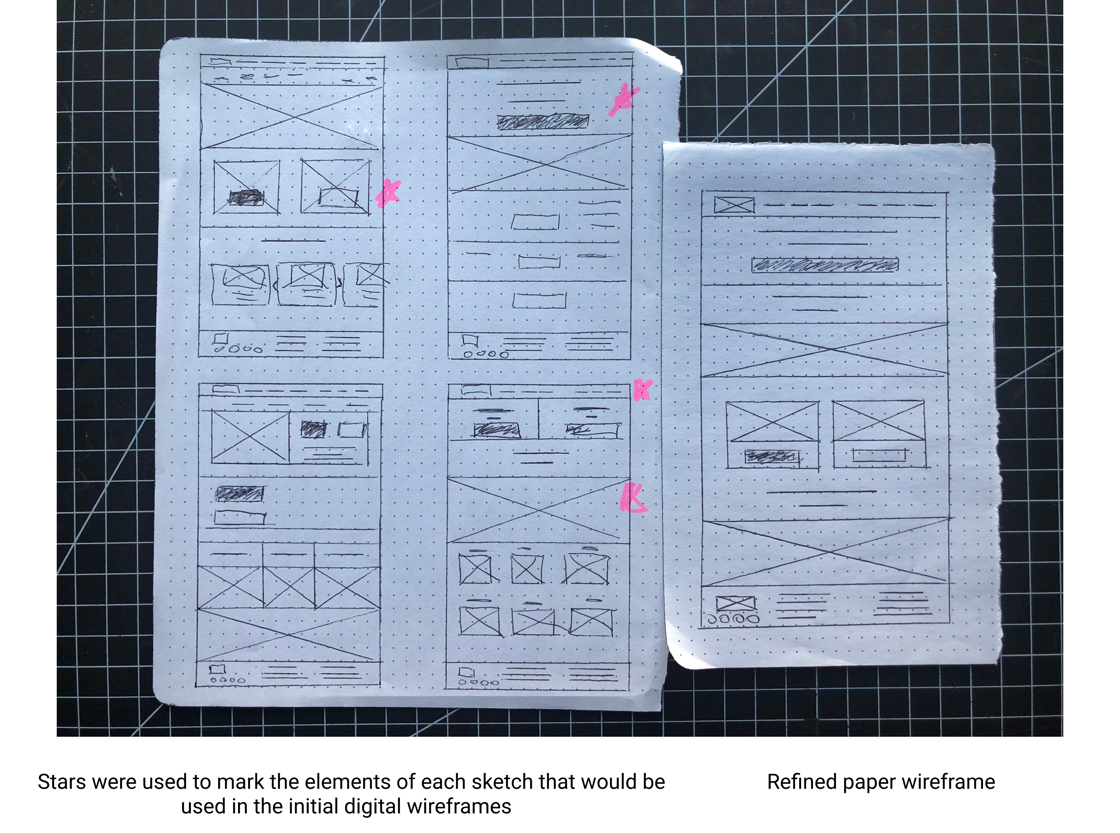
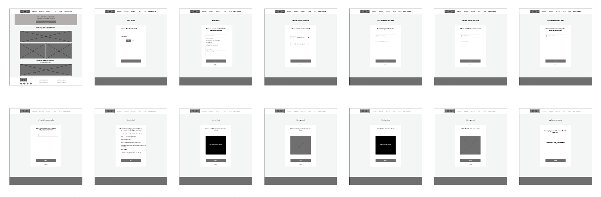
Paper wireframes
Next, I sketched out paper wireframes for each screen in my app, keeping the user's pain points about navigation and browsing.
The home screen paper wireframe variations to the right focus on optimising the browsing experience for users.
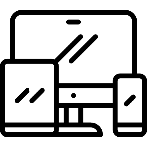
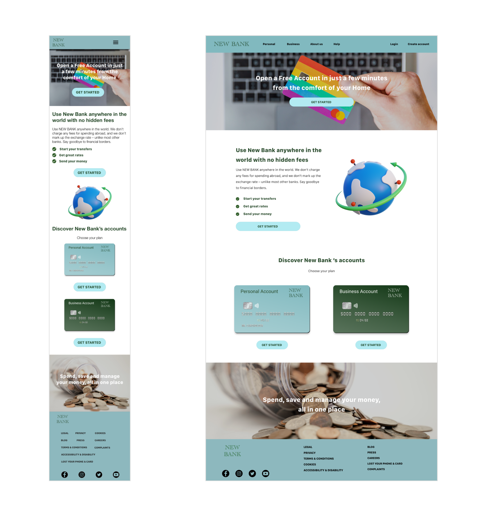
Screen size variations
Because New Bank customers access the site on a variety of different devices, I started to work on designs for additional screen sizes to make sure the site would be fully responsive.
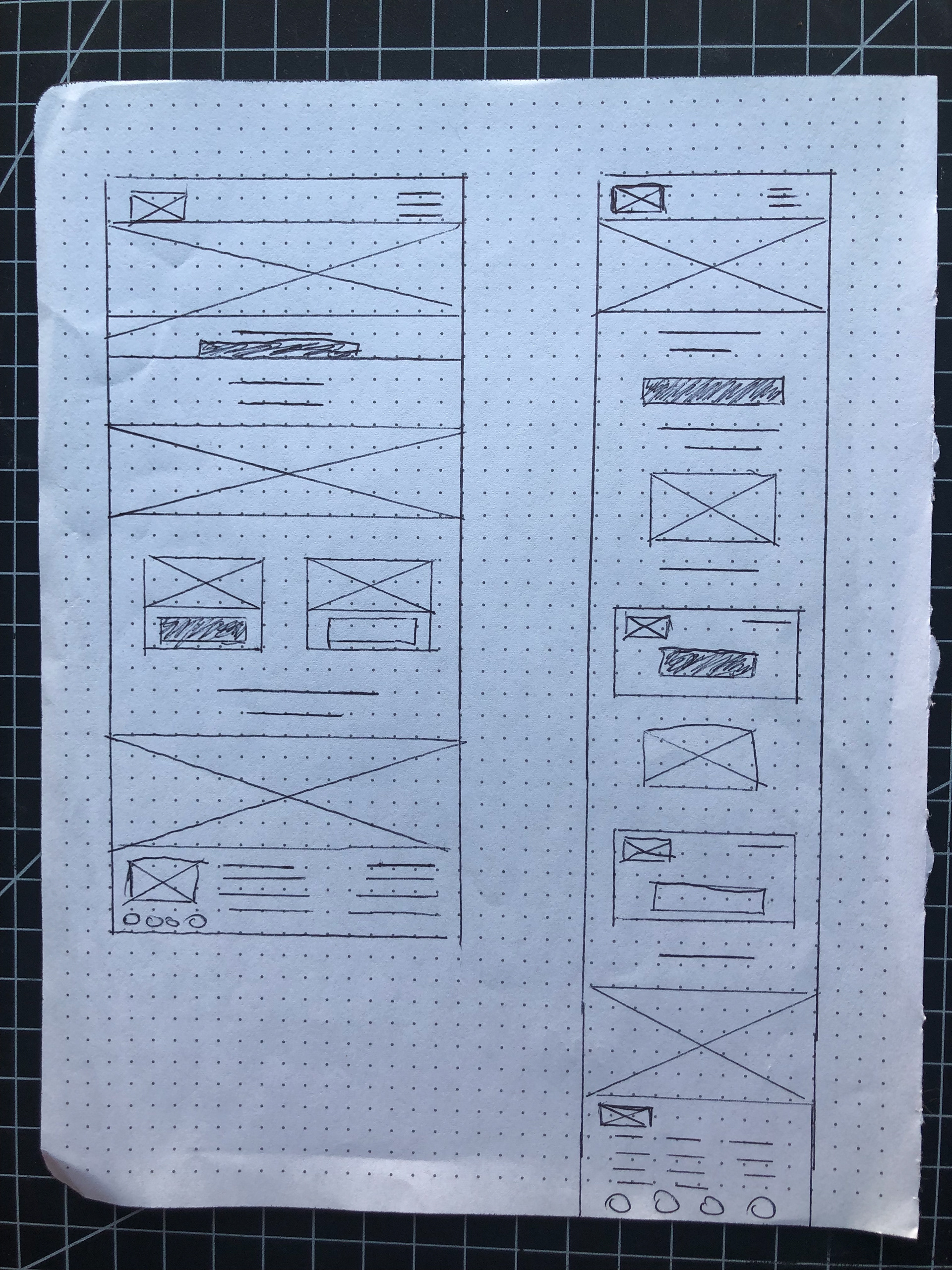
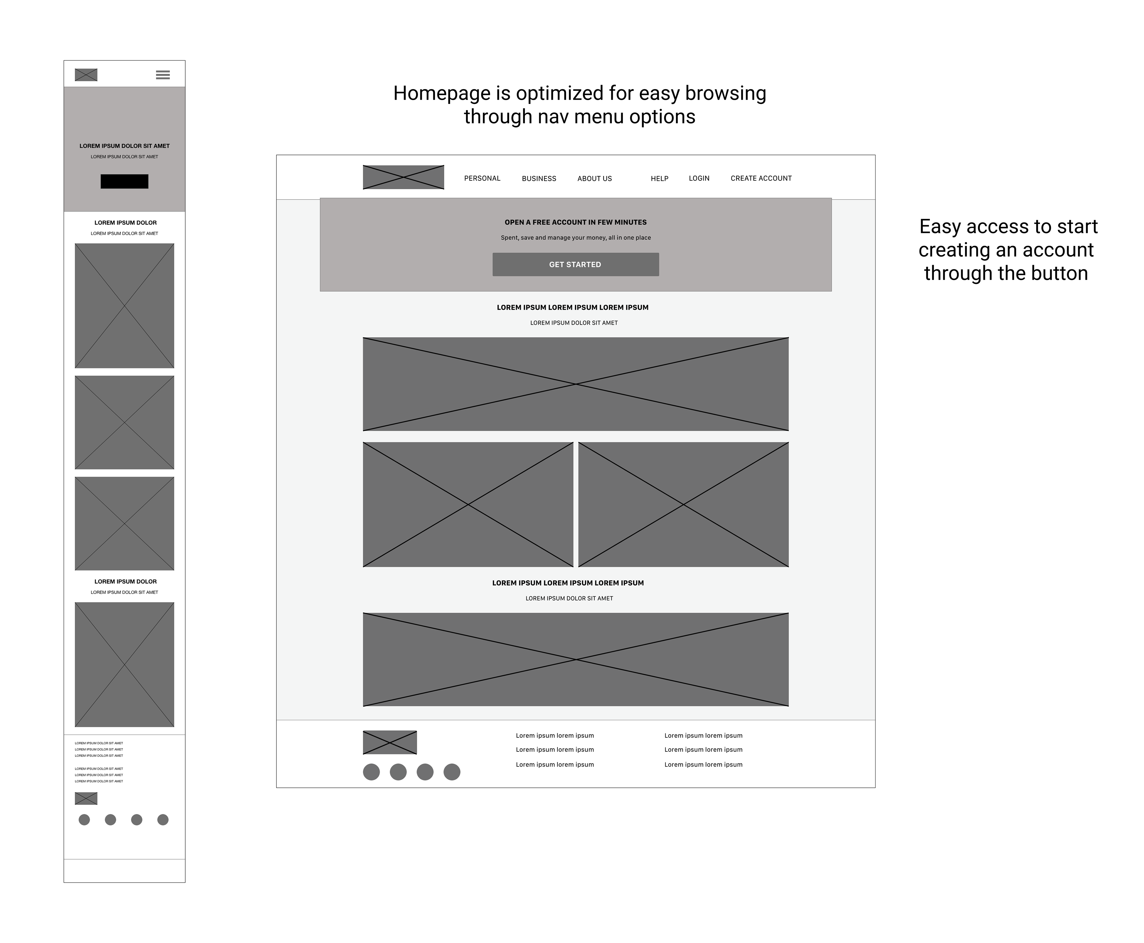
Digital wireframe screen size variations
Moving from paper to digital wireframes made it easy to understand how the redesign could help address user pain points and improve the user experience.
Prioritising useful button locations and visual element placement on the home page was a key part of my strategy.
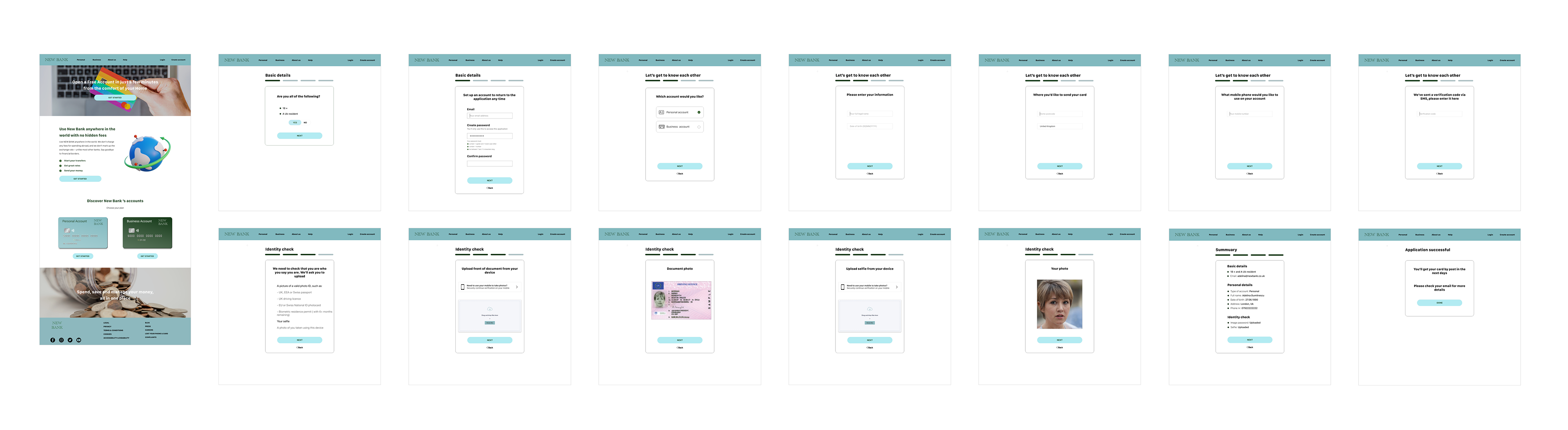
Low fidelity prototype
At this point, I had received feedback on my designs from members of my team about things like placement of buttons and page organisation. I made sure to listen to their feedback, and I implemented several suggestions in places that addressed user pain points.
Usability study: parameters
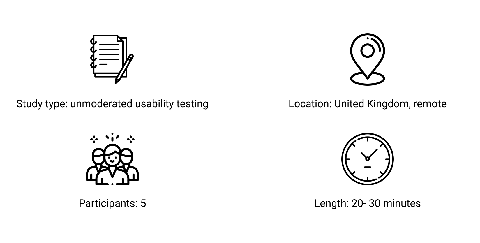
Usability study: finding

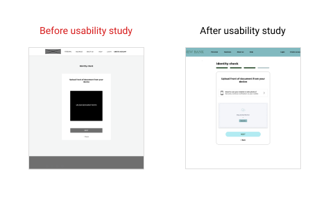
Upload photos
Once users are on a desktop they are going on mobile to take a photo and then they have to figure out a way to transfer the photos back to their desktop to upload.
REFINING THE DESIGN
Mockups
Based on the insights from the usability study, I made changes to improve the identity check flow. Most people would reach for their mobile, take a photo, and then figure out a way to transfer the photos back to their desktop to upload.
One of the changes I made was adding the card if you need the mobile to upload a photo, a cross-device option and the upload ability to stay on the same screen. This allowed users more freedom to upload photos without going through a complicated process.
Original screen size
Screen size variations
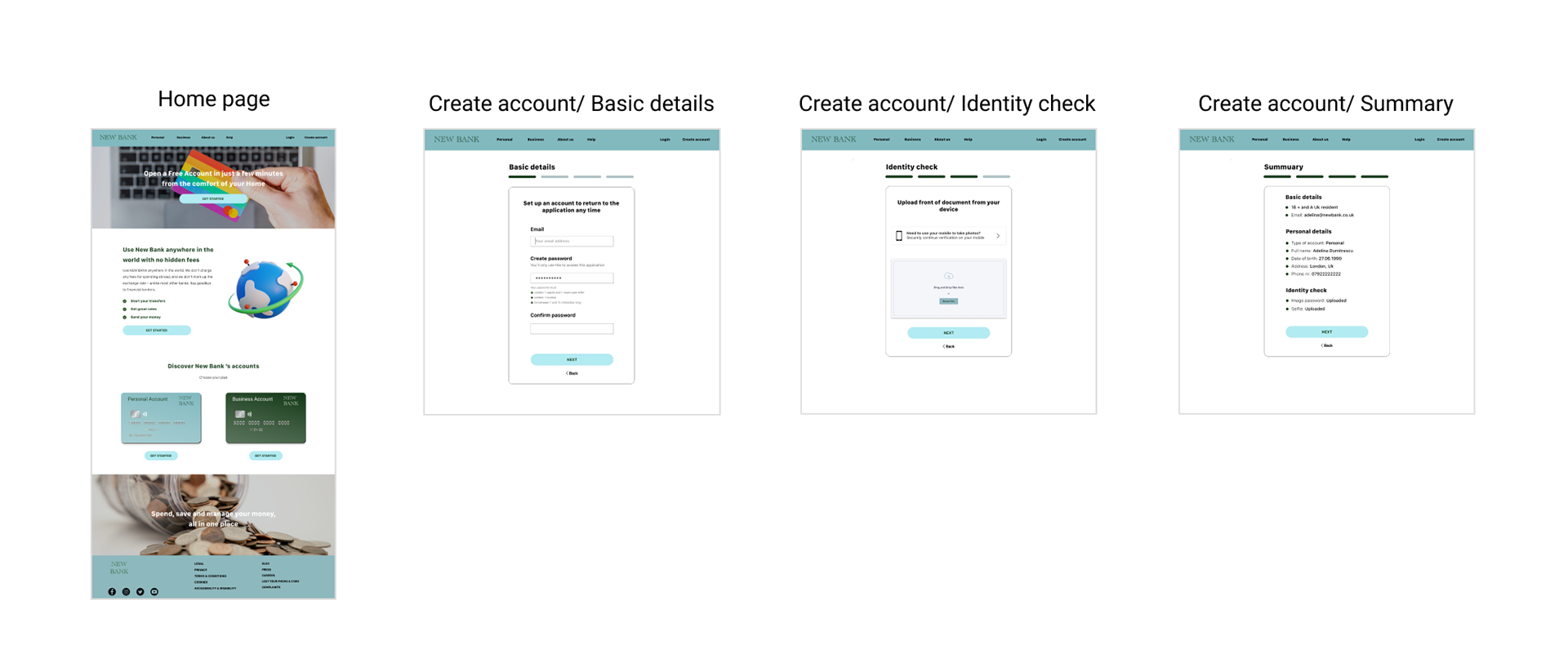
Hi fidelity prototype
My hi-fi prototype followed the same user flow as the lo-fi prototype and included the design changes made after the usability study, as well as several changes suggested by members of my team.
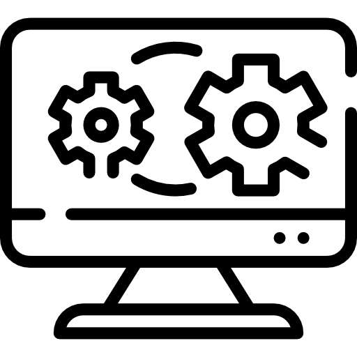
Accessibility considerations

I used headings with different sized text for clear visual hierarchy.

I designed the site with alt text available on each page for smooth screen reader access.
GOING FORWARD
Takeaways
Impact
Our target users shared that the design was intuitive to navigate through, more engaging with less clicks, and demonstrated a clear visual hierarchy.
What I learned
I learned that even a small design change can have a huge impact on the user experience. The most important takeaway for me is to always focus on the real needs of the user when coming up with design ideas and solutions.
Next steps

Conduct follow-up usability testing on the new website.

Identify any additional areas of need and ideate on new features.