PROJECT OVERVIEW
This is a project I created as a part of Google Professional UX Certification and the reason I added this project to my portfolio is the love and respect for art, artists and people who are involved in this and also because I find it challenging due to technical constrains and the VR environment.
The product 📱
Art on mobile is an app which will help you to explore in Virtual Reality one of the greatest galleries for contemporary art in London anytime and anywhere from your mobile phone. The app offers an audio guide and chat with the exhibition artists. The app’s target users are art lovers who lack the time or ability to visit/ see an art gallery.
Project duration 🕓
March 2021- August 2021
The problem ❗️
Art lovers lack the time and ability to visit/ see art galleries.
The goal ⭐️
Design an app that allows users to easily see their favourite art galleries.
My role 👤
UX designer designing an app from conception to delivery.
Responsibilities 🔖
User research, paper and digital wireframing, low and high-fidelity prototyping, conducting usability studies, accounting for accessibility, and iterating on designs.
UNDERSTANDING THE USER
USER RESEARCH: SUMMARY
I conducted interviews and created empathy maps to understand the users I’m designing for and their needs. A primary user group identified through research was busy with limited time art lovers.
Research also revealed that time was not the only factor limiting users from visiting art galleries. Other user problems included obligations, financial, traveling or challenges that make it difficult to visit art galleries.
Conduct user interview 💬
The key to empathising with users is to make sure I interview a representative sample that includes both the target user group and user groups that are often marginalised. What I need to do to achieve this goal:
Determine interview goals 💡
I want to ensure that the interviews I conduct are worthwhile, both for me and for the participants. I need to determine clear goals for the interview. As a UX designer, what do I want to learn from the interviews? Are there certain user problems or pain points that I need to empathise with?
✔️ I want to know how art gallery visitors feel when they see their favourite arts virtual.
✔️I want to identify frustrations art gallery visitors experience with the process of finding and scheduling art gallery tours.
✔️ I want to understand common challenges art gallery visitors trying to manage their gallery tour with a busy schedule or going too far.
Write interview questions ✍🏻
With the goals of the interview in mind, I can write the questions that I’ll ask real people during interviews.
1. Can you describe your current free time situation and how you manage it for visiting art galleries?
2. Can you describe your experience with finding and scheduling art gallery tours?
3. What challenges do you face managing the visit of your favourite art galleries? How does this make you feel?
4. Is there any way in which you feel these challenges could be resolved?
5. How do you feel when you see your favourite art and artist online?
Target participant characteristics ⚧
✔️art lovers ✔️employed / students ✔️ages 18-75 (include participants of different genders and with different abilities)
USER RESEARCH: PAIN POINTS
Time ⏰
Busy with limited time art lovers who don’t have time to visit art galleries.
Accessibility 🪜
Art galleries are too busy and noisy and sometimes is difficult to see the exhibition/read text or hear the audio guide.
Financial/ Traveling 💰🚘
If users are not from London traveling to visit a gallery art is difficult and expensive.
PERSONAS
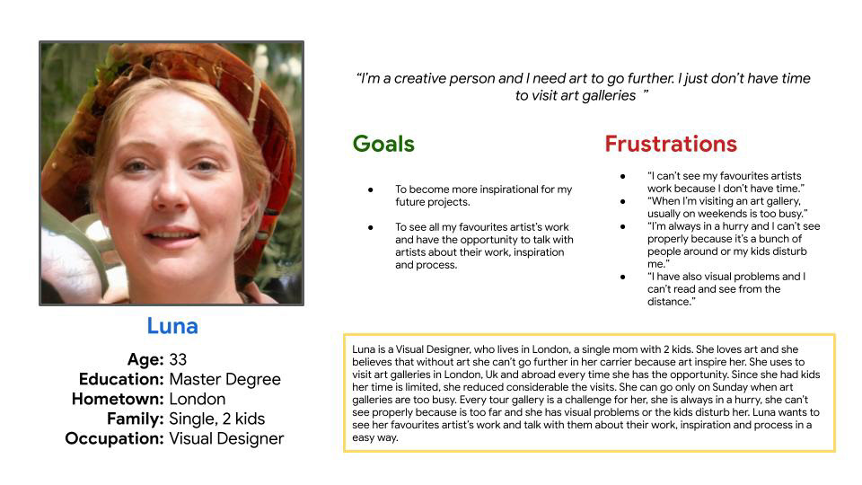
Keeping in mind everything that I’ve learned so far, I build two personas. Each persona that I create will represent a group of users with similar characteristics that I’ve learned about through my research. Personas are key to the design process because they reflect the lifestyles of users and give your team an idea of how to meet users’ needs or challenges.
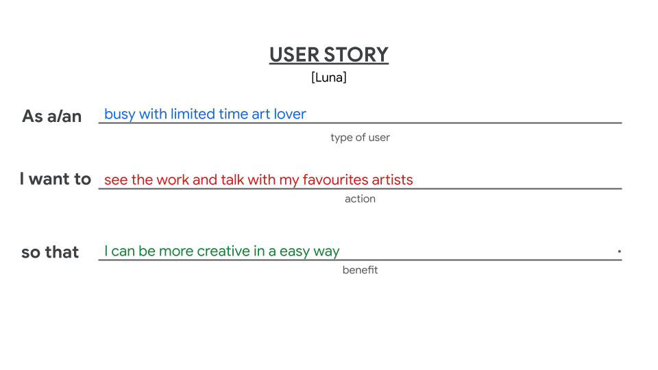
Persona LunaProblem statement
Luna is a busy with limited time art lover who needs an easy way to see work of her favourites artists and also talk with them because she doesn’t have time to visit art galleries.
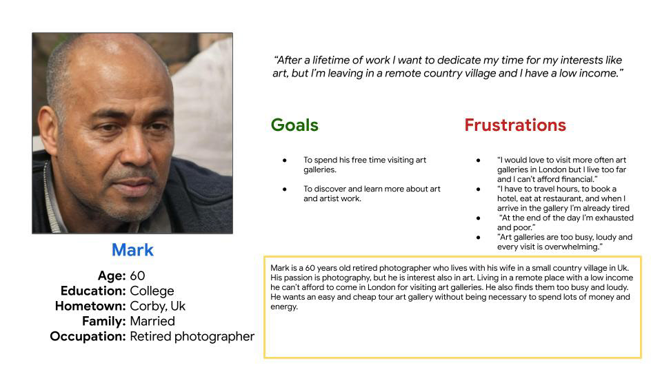
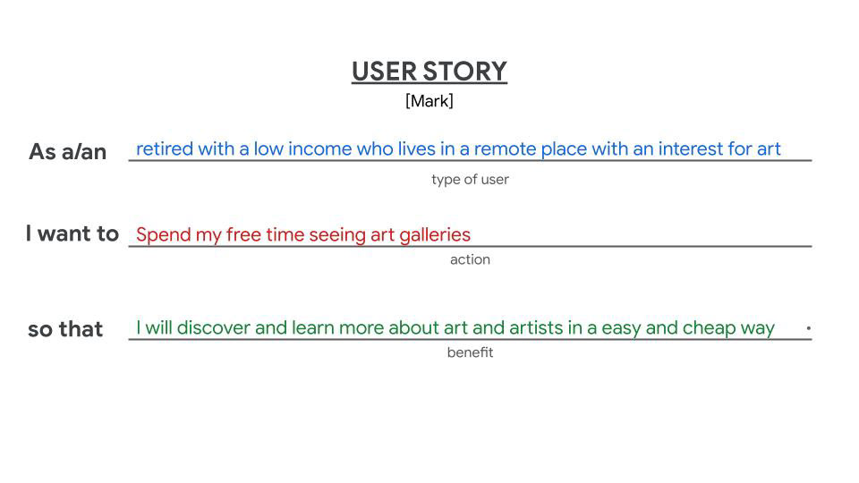
Persona Mark
Problem statement
Mark is a retired with a low income living in a remote place who needs an easy and cheap way to see art and artists because he has time to spend to visit art galleries.
User story
Another helpful way to understand my users is to build a user story around their experiences with my product. This is a great opportunity to use my imagination as I create the stories that capture the needs of my users.
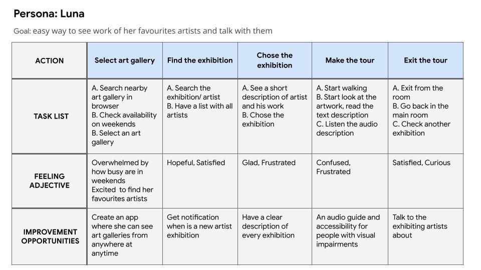
User journey map
A user journey is the series of experiences a user has as they interact with my product. User journeys build off the personas and stories I've already created. They help me think and feel like the user.
Mapping Luna’s user journey revealed how helpful it would be for users to have access to a virtual tour art gallery app.
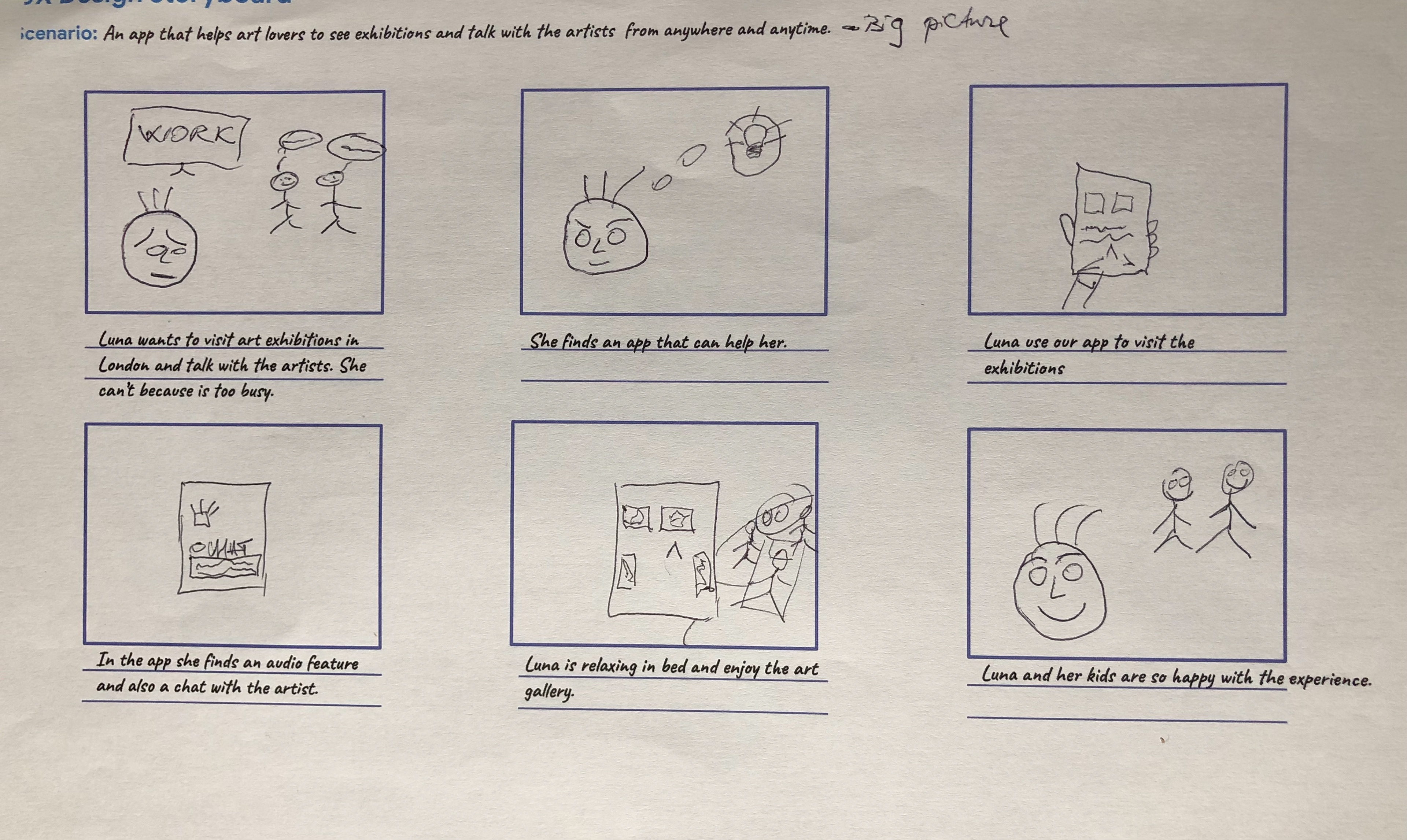
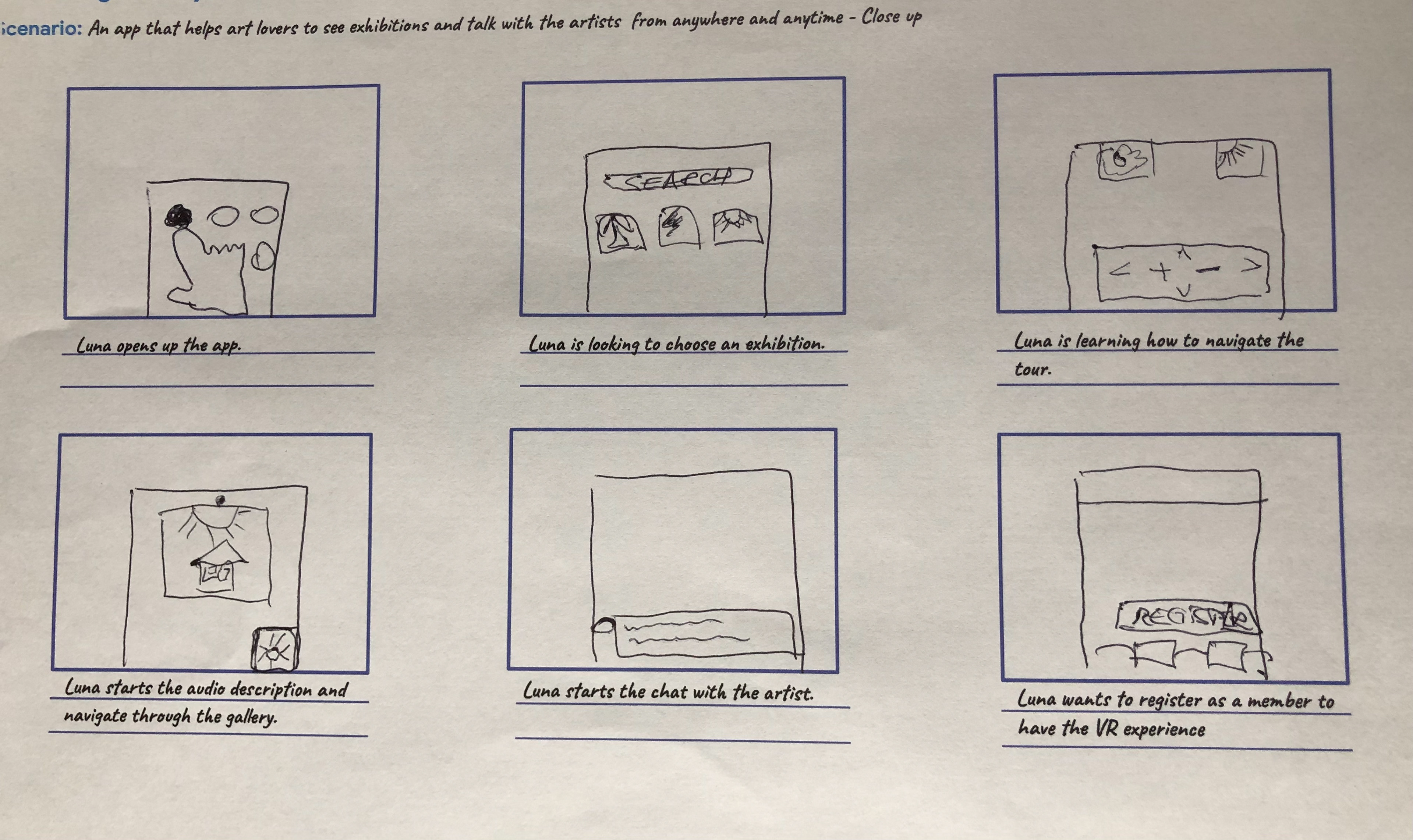
Storyboards
A storyboard is a series of panels or frames that visually describes and explores a user’s experience with a product. Telling a story through visuals is often more effective than using words. I created two types of storyboards:
Big picture storyboards focus on what the user needs, their context, and why the product will be useful to the user.
Close-up storyboards concentrate on the product and how it works.
To create both of them I followed same steps, starting with the problem statement, create a goal statement and setup the storyboard, add the story board scenario.
STARTING THE DESIGN
IDEATION
After I empathised with my users and determined their pain points, I start thinking of ways to solve my user’s problems. When I start thinking of ideas, I want to come up with as many as possible. The aim is to generate lots of ideas, even ones that may seem ridiculous at first.
Recognise business needs during design ideation
We need to consider both the business needs and the user's needs when designing. When I ideate, it's important to think about the business I'm designing for. This includes the business's voice, tone, and budget. It's helpful to research my brand's competitors as part of the design exploration. Knowing the successes and failures of my competition can help influence my design decisions.
Scope the competition
Competitive audits is an important part of the ideation process. A competitive audit is just one tool to explore ideas for designs, so I can learn from others about what has worked and not worked.
Competitive audit report
Goals of competitive audit
Compare the feature of Art on mobile app and the quality of his competitors.
Who are my key competitors?
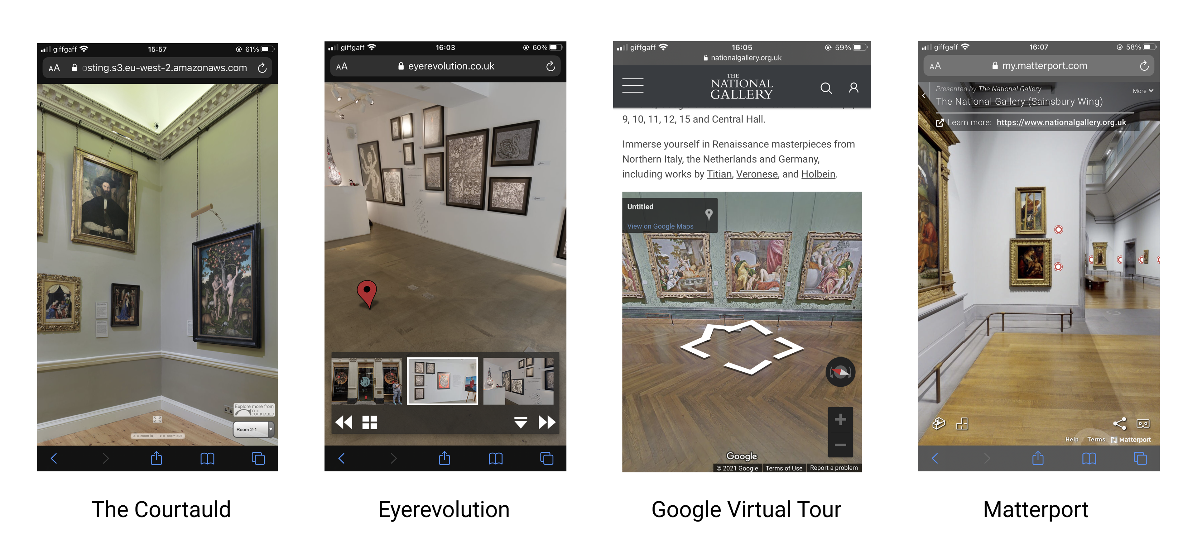
The Courtauld which is a direct competitor, is one of London’s must-see art museums. It also holds an outstanding collection of drawings and prints and fine works of sculpture and decorative arts.
Eyerevolution provides virtual tours for different industries, art galleries from London like Tate and Soho Art Gallery.
Google Virtual Tour provides virtual tours for The National Gallery London.
Matterport provides virtual tours for different industries, for National Gallery London.
What are the type and quality of competitors’ products?
The Courtauld - the virtual tour app is simple and clean, they use earth colours like green, brown, victorian building design that calls to mind elegant and it gives you the feeling that you are there. It doesn't have any feature for accessibility but it has zoom in with a very good quality of the images. Reading text is not visible. On the home screen it has instructions for using the tour for all devices: mobile, tablet and desktop. There are intuitive and simple touch screens for a mobile user. It is very confusing because it shows on the navigation bar "a" and "z" letters for zoom in and out which are supposed to be shown on desktop not on mobile. It has a menu button with every room you can visit which looks old school. It's confusing when you want to exit the virtual tour, you don't know what to do, there is a button which doesn't look like a button " Explore more from “The Courtland" above the menu with the rooms. You can choose the exhibition from the navigation menu by touching the image. No chat with the artist or any feature.
Eyerevolution for Soho Art Gallery exhibition 360s - the app is simple and clean, it looks modern. You can see the building entrance in the gallery from the street, with all the details you have the feeling that you are there. It doesn't have any feature for accessibility but it has zoom in with a very good quality for images and reading. Navigation menu which is more intuitive rather than explicit.You can choose the exhibition from the navigation menu by touching the image. No chat with the artist feature. You can interact with some of the video works, tap on the thumbnail and enlarge on full screen. It has an audio feature with ambient music.
Google Virtual Tour for The National Gallery London - you can't go in full screen on mobile, just on desktop and it looks more like a picture in a web site rather than a virtual tour. You don't have the feeling that you are there. It doesn't have any feature for accessibility, the images are poor quality and you can't read the text. It is not intuitive, there are some signs on the floor which I don't understand and a rotate image button and a plus and minus button for zoom in and out. No chat with the artist or any other feature.
Matterport for The National Gallery London ( Sainsbury Wing) - it doesn't give you the feeling like you are there, it looks like a picture with some graphics on it. The images and reading are not good visible, no accessibility features.There is no navigation menu with instructions how to use the app. You have some signs on the floor. Is intuitive for a mobile user but not for somebody who is less tech savvy. No chat with the artist, it has a VR feature in collaboration with Oculus.
How do competitors position themselves in the market?
The Courtauld position itself in the market like the virtual tour uses a new photographic technique to show The Courtauld Gallery in exceptional close-up quality. "You can roam each room of the Gallery and zoom in to look closely at masterpieces from individual brush strokes to the texture of the paint."
Eyerevolution for Soho Art Gallery exhibition 360s - is a 360 photography company, based in London and working worldwide. "We specialise in exceptional 360 photography for the automotive & aviation industries, and wherever phenomenal high resolution 360 photography is required, we trust that our client list speaks for itself. Services include 360 photography, 360 video, gigapixel photography, drone photography & 360 video. We create interfaces that maximise user engagement with your 360 tours, they can be used in VR headsets, kiosks and even printed. Our work is HTML5 based and use on mobile devices is at the forefront of our planning. Exceptional 360 content, beautifully executed, has the power to rise above the crowd and truly engage with viewers."
Google Virtual Tour for The National Gallery - they have Google Tour Creator app to create and publish virtual reality tours. You can use Google Street View panoramas, add your own images from 360 cameras, and annotate the tour with details and facts, to create immersive experiences.
Matterport for The National Gallery London ( Sainsbury Wing) - they have a Matterport Showcase app. "You can download it as an app or access it through any web browser, experience your space in walk-through mode, dollhouse view, and floor plan mode, share the link via email, text message, Facebook, Twitter, or other social media, view your space in VR, access and explore your digital twins offline."
What do competitors do well? What could they do better?
Things The Courtauld does well
✔️a very good quality of images
✔️on the home screen it has instructions for using the tour for all devices: mobile, tablet and desktop
✔️you can choose the exhibition from the navigation menu by touching the image
Things The Courtauld could do better
✔️a good quality for reading
✔️better navigation instructions for mobile
✔️better visual design for the buttons
✔️audio or reading accessibility
Things Eyerevolution for Soho art Gallery does well
✔️visual layout is simple, clear and modern
✔️very good quality of the images and reading
✔️you can choose the exhibition by touching an image
✔️ you can interact with some of the video works
✔️ it has an audio feature with ambient music
Things Eyerevolution for Soho art Gallery could do better
✔️explicit navigation menu
✔️chat with the artist
Things Google Virtual Tour for The National Gallery does well
✔️it is intuitive for somebody who is used with devices
Things Google Virtual Tour for The National Gallery could do better
✔️ better quality for images and reading
✔️explicit navigation menu
Things Matterport for The National Gallery London does well
✔️ you can see the tour in VR
Things Matterport for The National Gallery London could do better
✔️ better quality for reading and images
✔️explicit navigation menu
Ideate using Crazy Eight
Crazy Eight is an exciting design ideation exercise that generates a lot of ideas in a small amount of time, also forces me to think outside the box because I have to come up with many ideas in a short timeframe. It's fun and I can let my creativity flow without judgement, and come up with some awesome ideas!

Paper wireframes
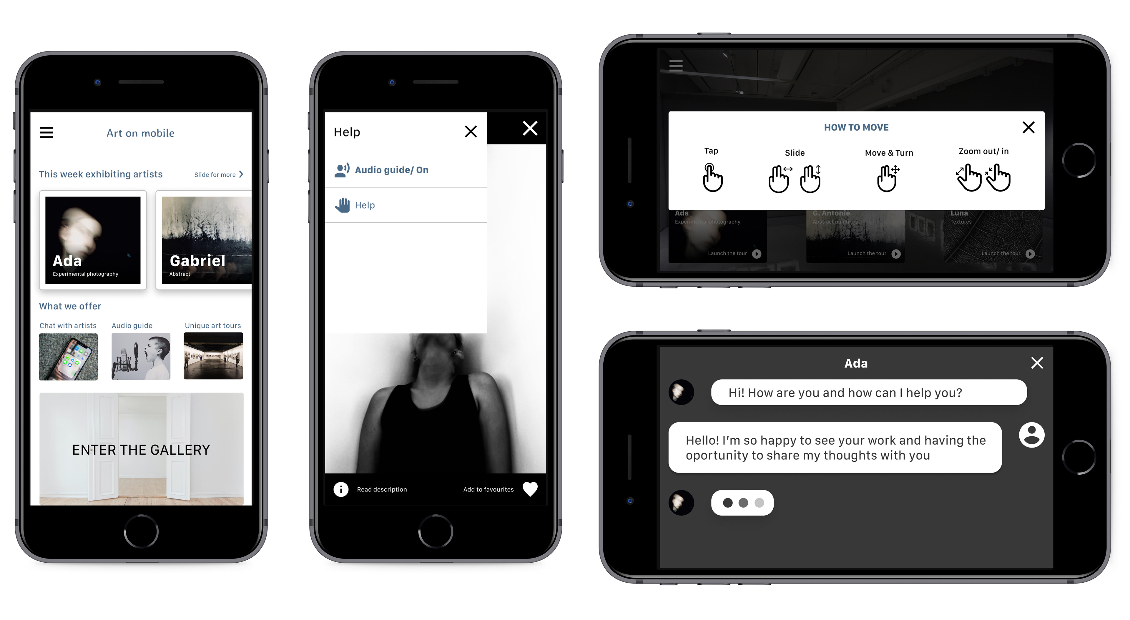
Taking the time to draft iterations for each screen of the app on paper ensured that the elements that made it to digital wireframes would be well-suited to address user pain points. For the home screen, I prioritised “choose the exhibition” and “enter the gallery” to help users navigate easy and quick.
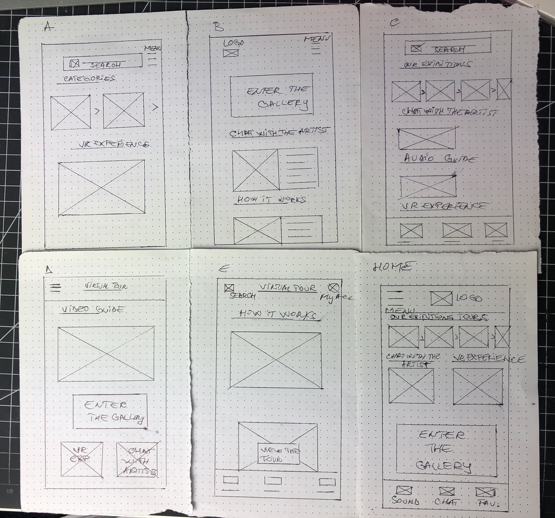
Digital wireframes
As the initial design phase continued, I made sure to base screen designs on feedback and findings from the user research.
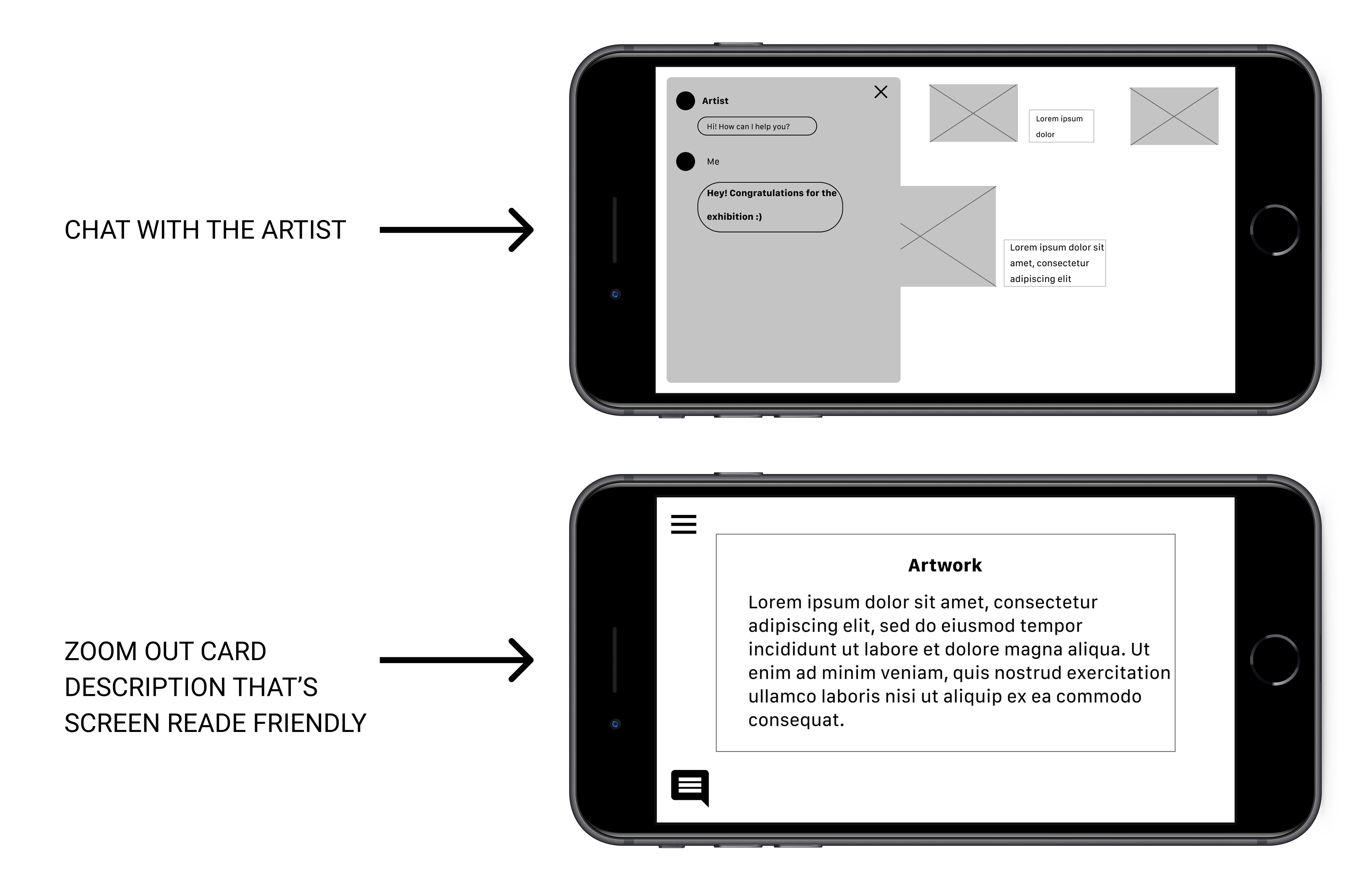
Easy screen reader and chat with the artists were keys user need to address in the designs.
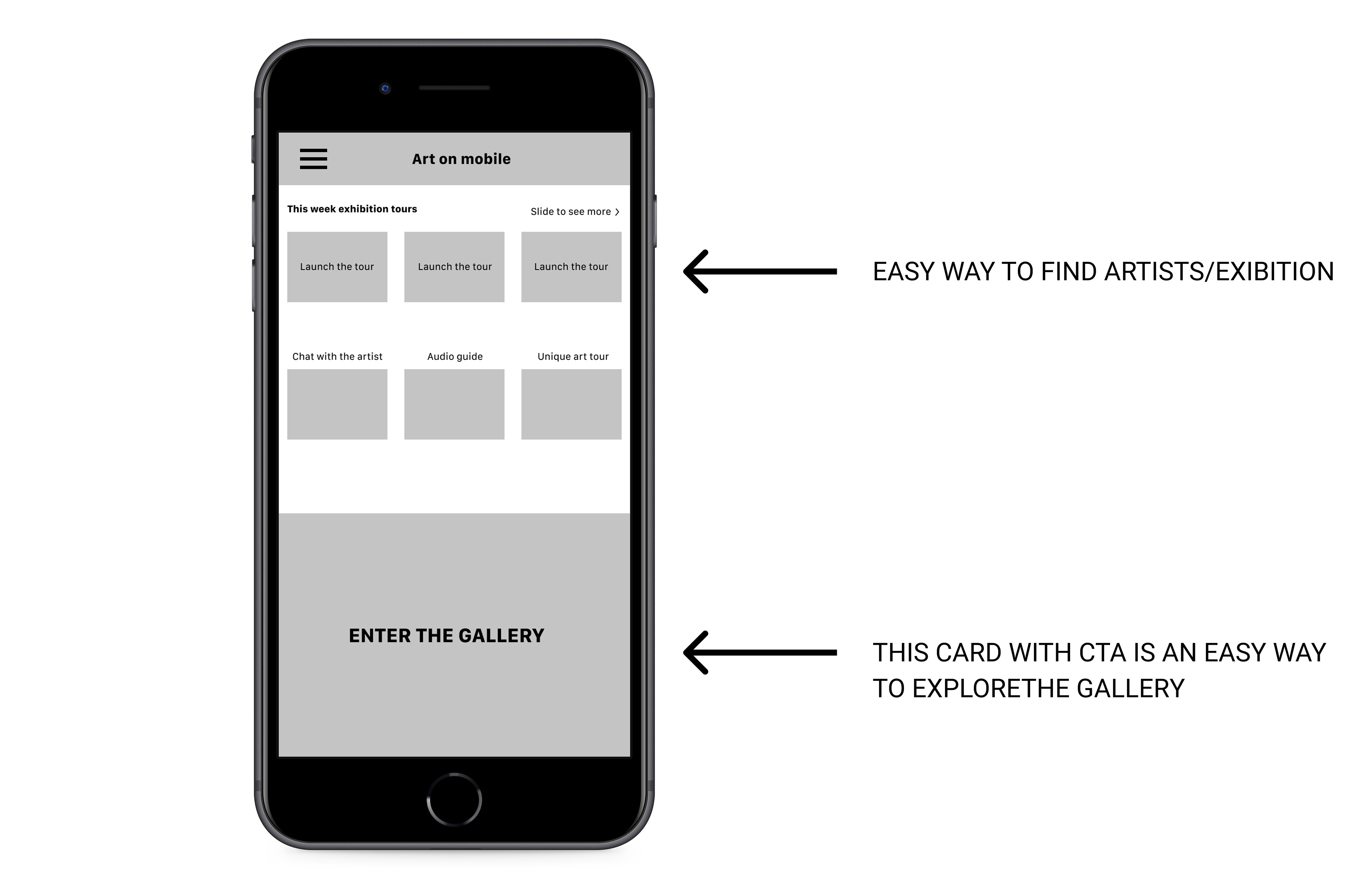
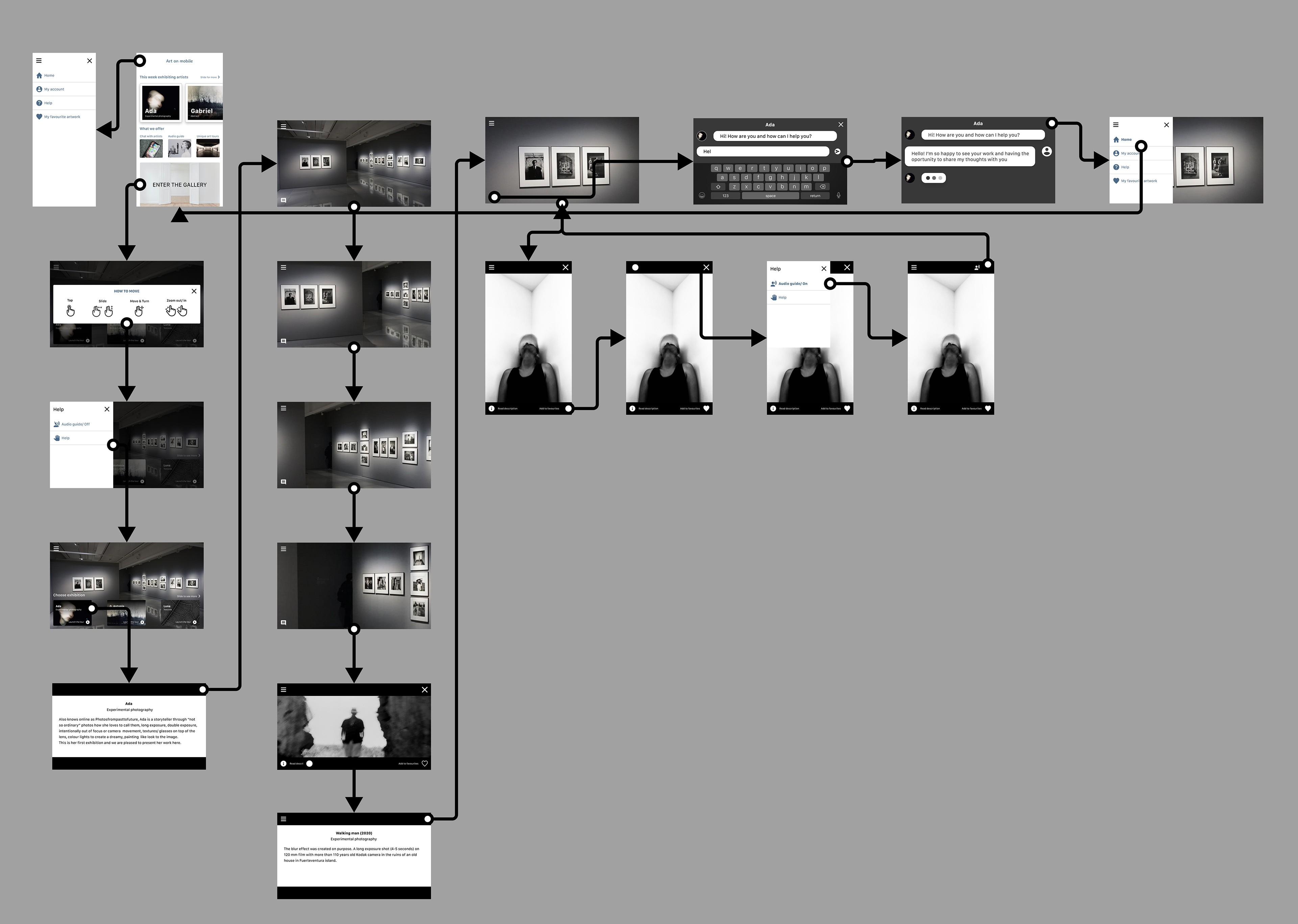
Low-fidelity prototype
The primary user flow I connected was building and visiting an art gallery, so the prototype could be used in a usability study.
View the Art on mobile low-fidelity prototype
USABILITY STUDY
To understand how real users interact with the design and how well the product meets their needs I decided to do an unmoderated usability study, participants have no human guidance and get a list of fixed questions and tasks.
UX Research Study - Plan
Introduction
Title: Usability study of Art on mobile
Author: Adelina Dumitrescu, UX Researcher, adelina27.dumitrescu@gmail.com
Stakeholders: Art on mobile - Senior executive - Nick Wright and Chief marketing officer - Maria Manitu
Date 22.04.2021
Project background We are creating an app who will help people to see virtual art galleries and also chat with the artist. We need to find out if the main user experience - seeing virtual art galleries and chatting with the artist is easy for users to complete. We would also like to understand the specific challenges that users might face in navigation, accessibility and chat during the virtual tour.
Research goals Determine if the users can complete core tasks within the prototype of Art on mobile. Determine if the app is difficult to use.
Research questions
How long does it take a user to make a virtual tour?
What can we learn from the user flow, or the steps that users take to finish a virtual tour?
Are there parts of user flow where users get stuck?
Are they using the chat with the artist?
Are there more features that users would like to see included in the app?
Do users think the app is easy or difficult to use?
Key Performance Indicators (KPIs)
✔️time on task ✔️conversion rate ✔️system usability scale
Methodology
Unmoderated usability study
Location: London (remote) - each participant will complete the study in their own home.
Session will take part on April 25 (normal business hour) and April 26 (after hours).
Length: Each session will last 15-20 minutes, based on a list of prompts.
Compensation: 15£ gift card for participating in the study.
Participants
Participants are all art lovers with a full time job and art lovers with free time who live outside London.
10 participants, can be of any gender, between the ages 25-75, one participant is with a visual impairment and another one with auditory impairment.
The study is accessible for use with a screen reader and a switch device.
Script
During the unmoderated usability testing, a list of prompts appears on the device screen.
Prompt 1 Choose an exhibition to launch a virtual tour from the home page.
Prompt 1 follow-up How easy or difficult was this task to complete? Is there anything you will change about the process?
Prompt 2 Start to move on the virtual tour screen.
Prompt 2 follow-up How easy or difficult was this task to complete? Is there anything you will change about the process?
Prompt 3 Start audio description.
Prompt 3 follow-up How easy or difficult was this task to complete? Is there anything you will change about the process?
Prompt 4 Zoom in on the painting you like.
Prompt 5 Start chatting with the artist.
Prompt 6 Exit the exhibition.
Prompt 6 follow-up How easy or difficult was this task to complete? Is there anything you will change about the process?
Prompt 7 How did you feel about this app overall? What did you like and dislike about it?
Have the participant complete the System Usability Scale, participants are asked to score the following 10 items with one of five responses that range from Strongly Agree to Strongly disagree:
I think that I would use this app frequently
I found the app unnecessarily complex
I found the app unnecessarily complex
I need the support of a technical person to be able to use this app
I found the app very difficult to use
I found the chat frustrating
I thought there was too much inconsistency in this app
I imagine that most people would learn to use this app very quickly
I felt very confident using the app
I needed to learn a lot of things before I could get going with this app
I found the navigation during the virtual tour difficult
I found the virtual tour unsatisfying
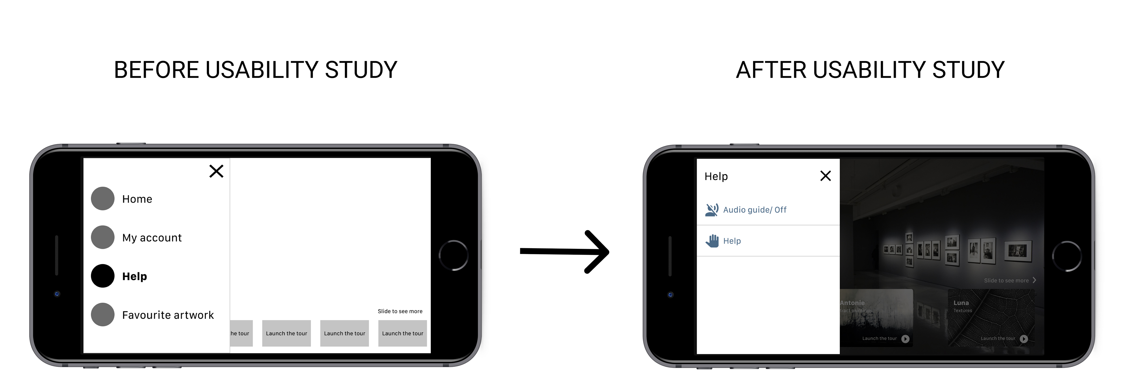
Usability study findings
Users want to easy find the sound button
Users are confused with the help button
Users want to know exactly what to do when they start to launch the tour
REFINING THE DESIGN
MOCKUPS
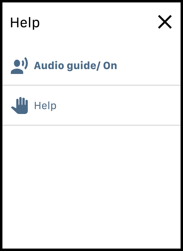
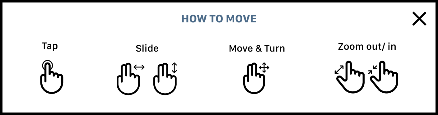
Early designs allowed for some customisation, but after the usability study, I added “How to move” card from the Menu/ Help which will opens automatically when users enter the screen and will help users to better understand how to navigate inside the gallery without having to ask how to do it or try to find out looking through the Menu.
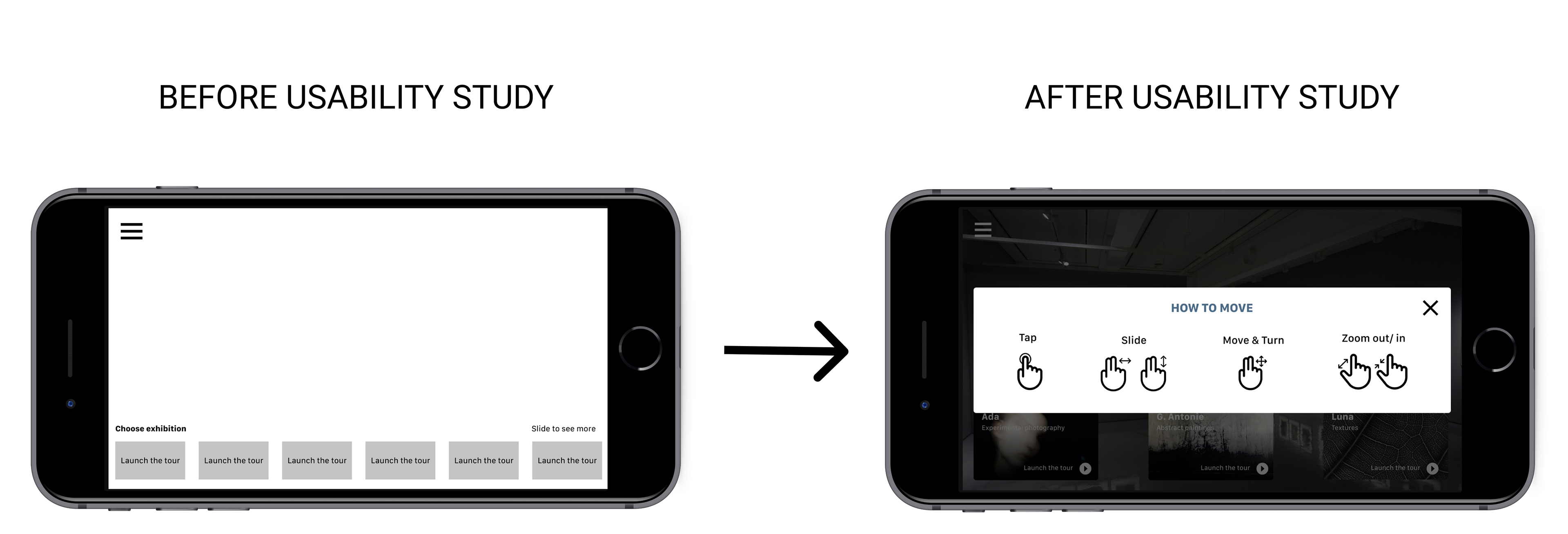
The usability study revealed frustration with the sound button and Help Menu being hidden under ‘Help’. The Help Menu will opens automatically after you close “How to move” card to show users where you they can find the card and also the Audio guide instead of looking through Menu.
High Fidelity Prototype
The final high-fidelity prototype presented cleaner user flows for entering the gallery, navigate into it. It also met user needs with the chat with the artist feature.
View the Art on mobile high-fidelity prototype
ACCESSIBILITY CONSIDERATIONS
Provided access to users who are vision impaired through adding audio guide for text reader
Used icons to help make navigation easier
Used detailed imagery for “how to move” to help all users better understand the navigation inside the gallery
TAKEAWAYS
Impact ✅
The app makes users feel like Art on mobile really thinks about how to meet their needs.
One quote from peer feedback:
“The app made it so easy to see my favourite exhibitions and is the first time in my life when I have the opportunity to talk with my favourite artists. I would definitely use this app.”
What I learned 📑
While designing the Art on mobile app, I learned that the first ideas for the app are only the beginning of the process. Usability studies and peer feedback influenced each iteration of the app’s designs.Next steps 👣
Conduct another round of usability studies to validate whether the pain points users experienced have been effectively addressed.
Conduct more user research to determine any new areas of need.