How I made a 'Design System'
As I am self taught I started creating components more from curiosity rather than trying to be efficient. However, as I learnt more it seemed like a good idea to put together the typography and a colour palette in a way where I could easily make changes across all screens.
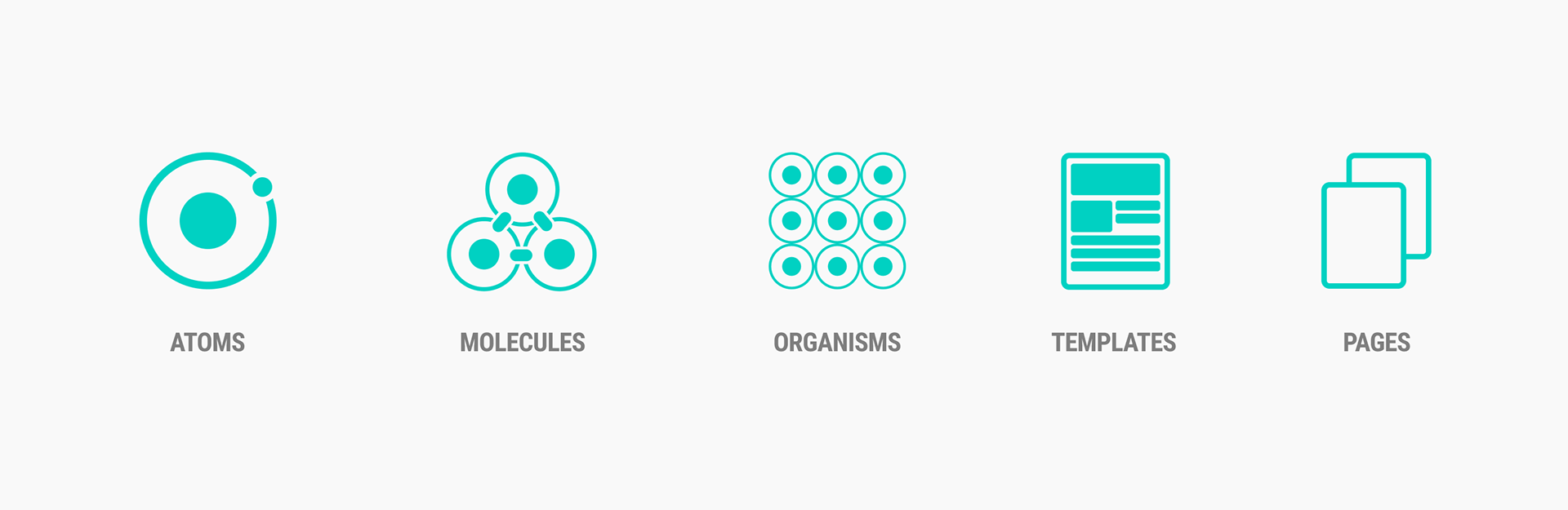
To have a better understanding of how should I approach this project I studied a bit Brad Frost’s famous Atomic Design Methodology where I've learned about "atoms, molecules, organisms, templates".
To have a better understanding of how should I approach this project I studied a bit Brad Frost’s famous Atomic Design Methodology where I've learned about "atoms, molecules, organisms, templates".
Atomic Design by Brad Frost
Atoms, Molecules and Organisms
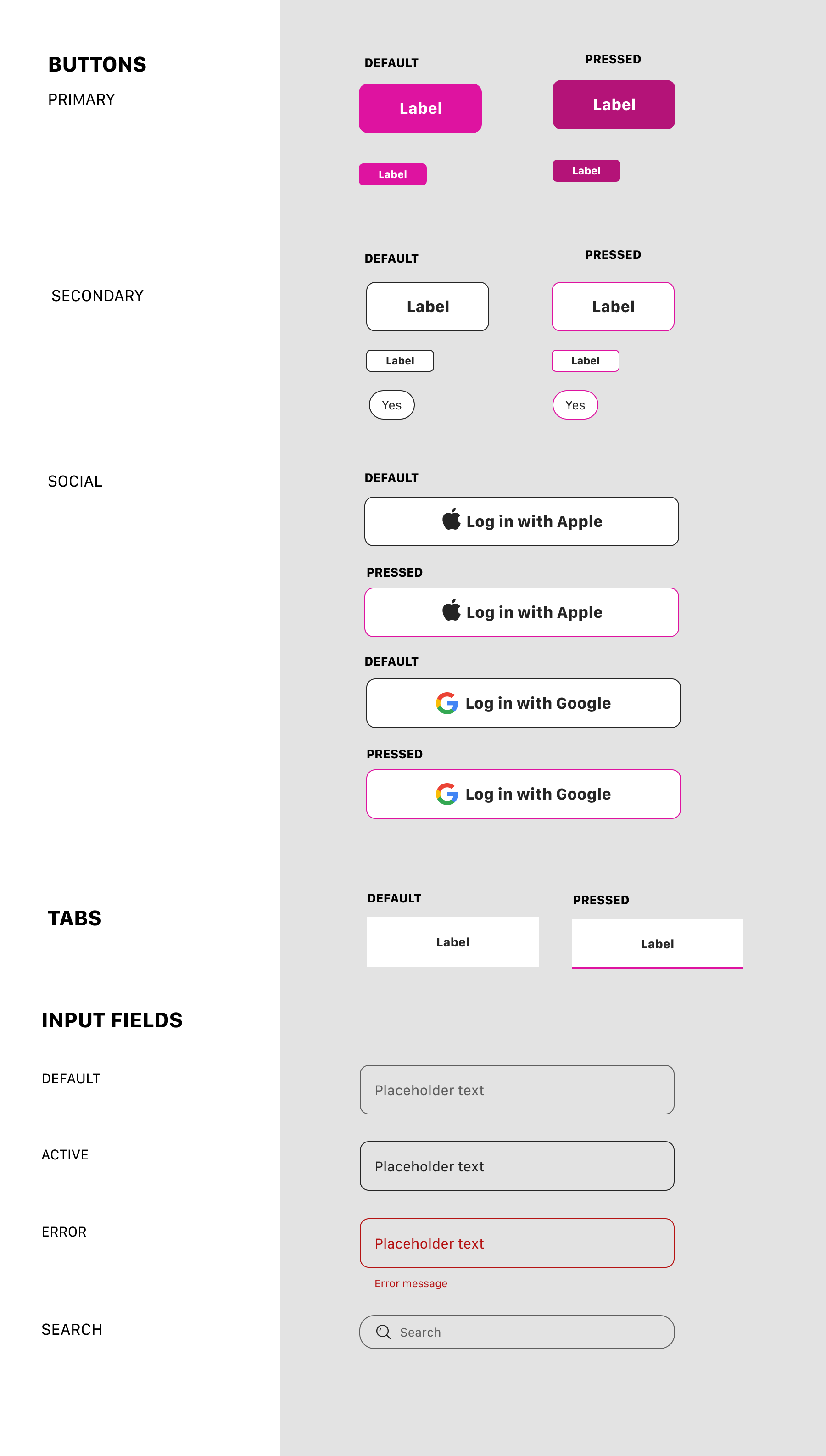
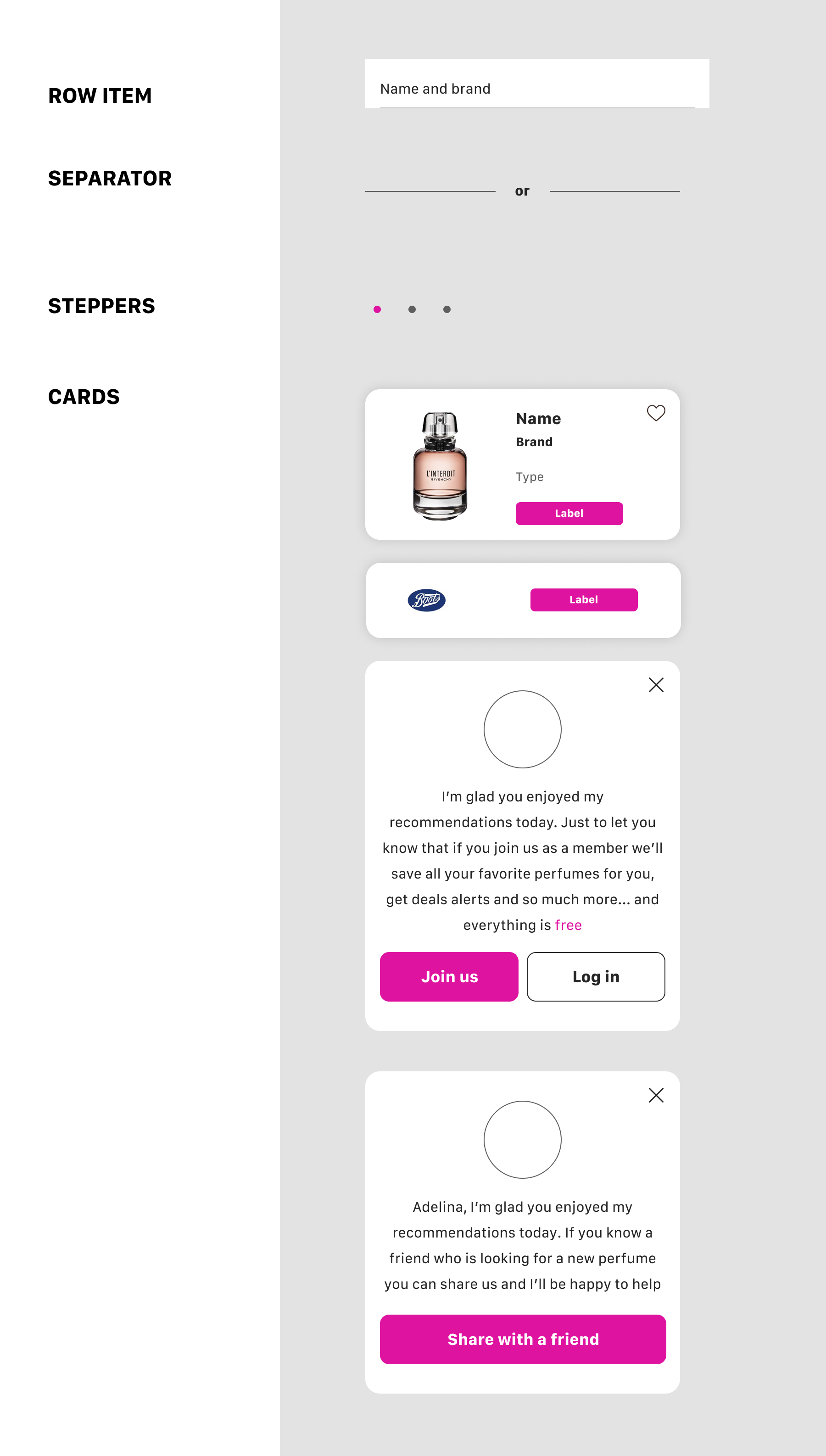
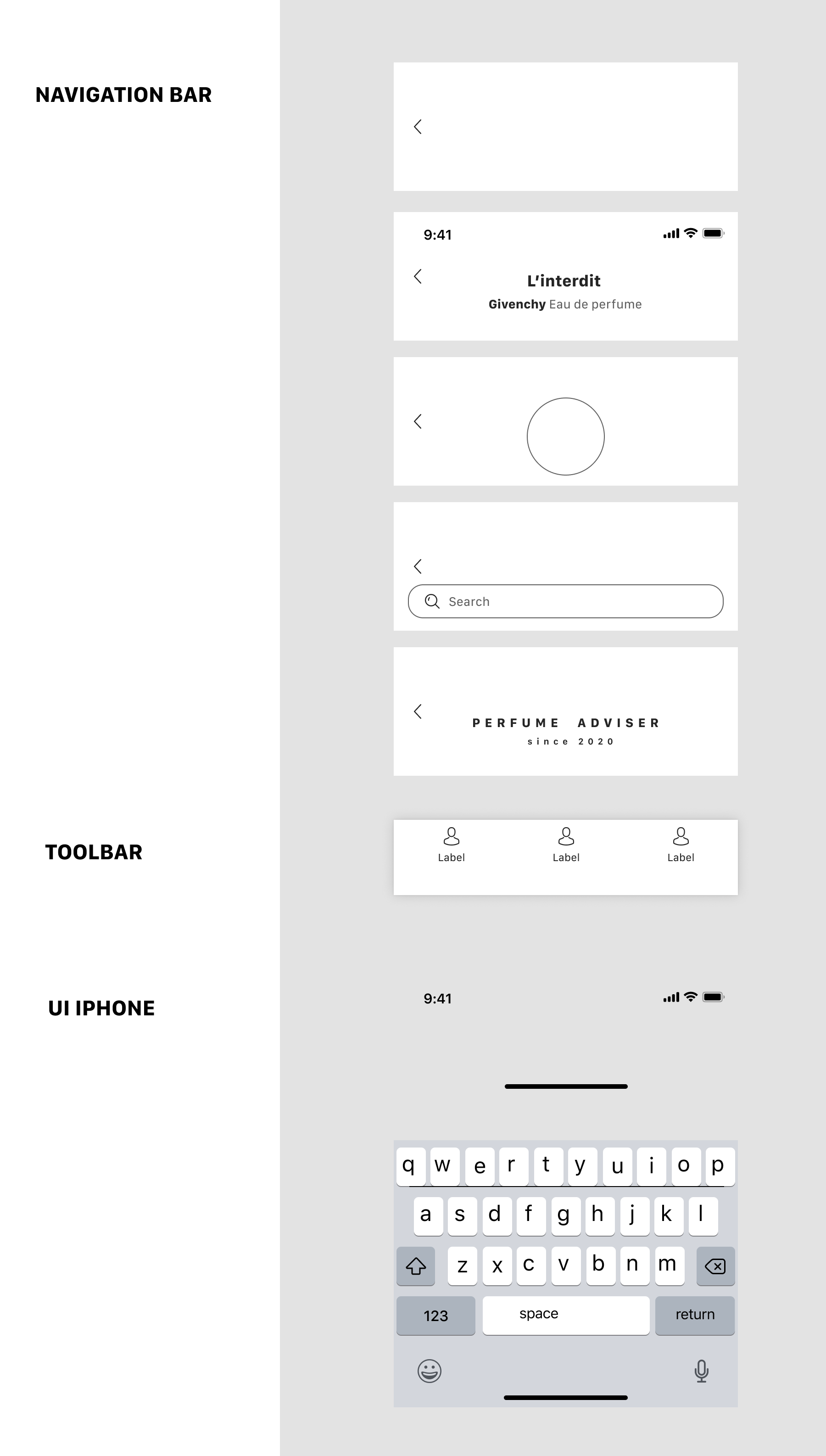
With other words, Atomic Design teaches that every interface of a website, app or anything similar consists of atomic elements, e.g. buttons, input fields or typography. These atoms can be used as standalone elements or combined to create larger and more complex elements called molecules, for example a search field. To create even larger elements, atoms and molecules can be combined to form organisms, a card, a header or a toolbar. Leaving the analogy of chemistry behind, atoms, molecules and organisms can be used to create whole templates of web or app pages.
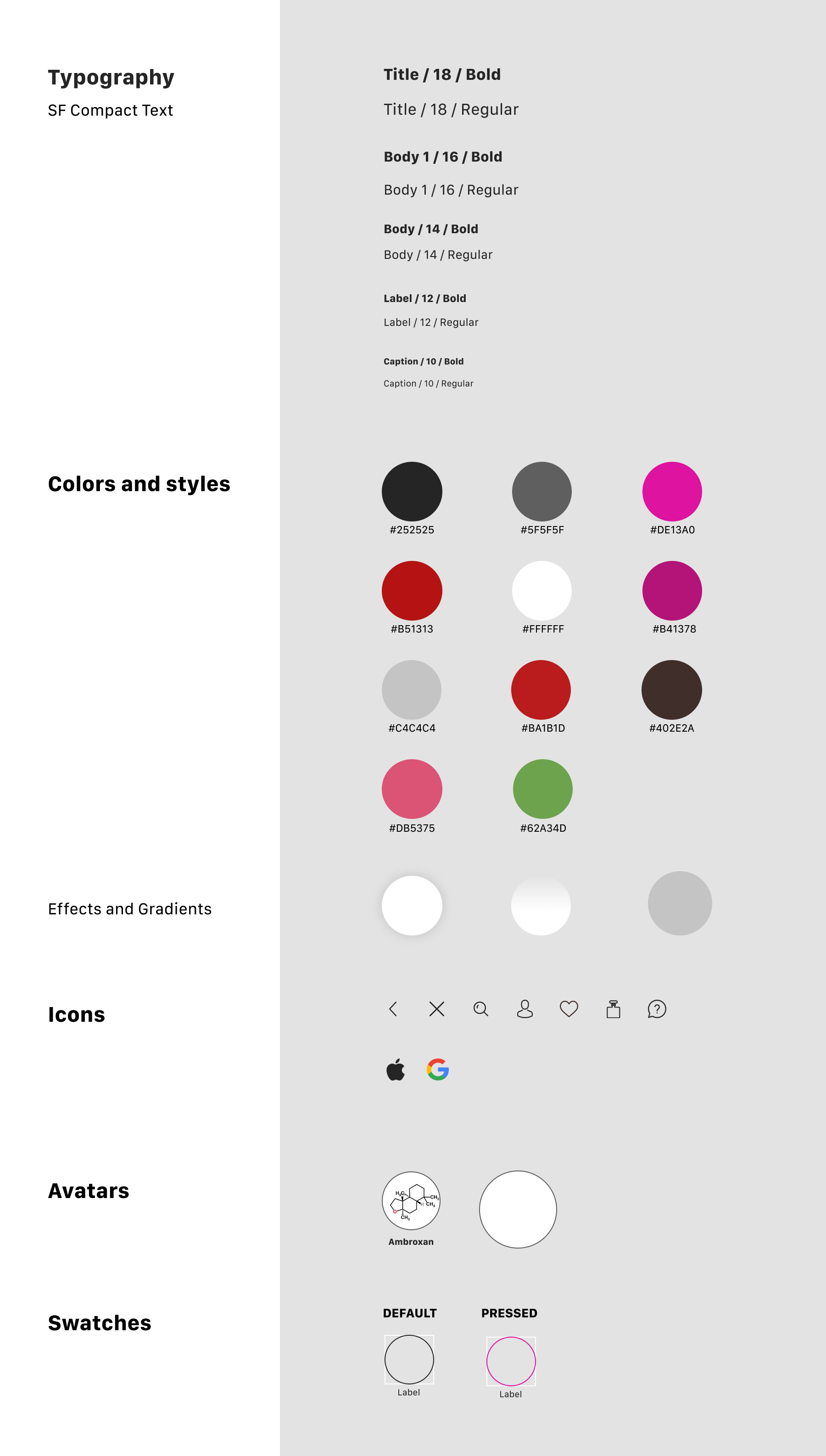
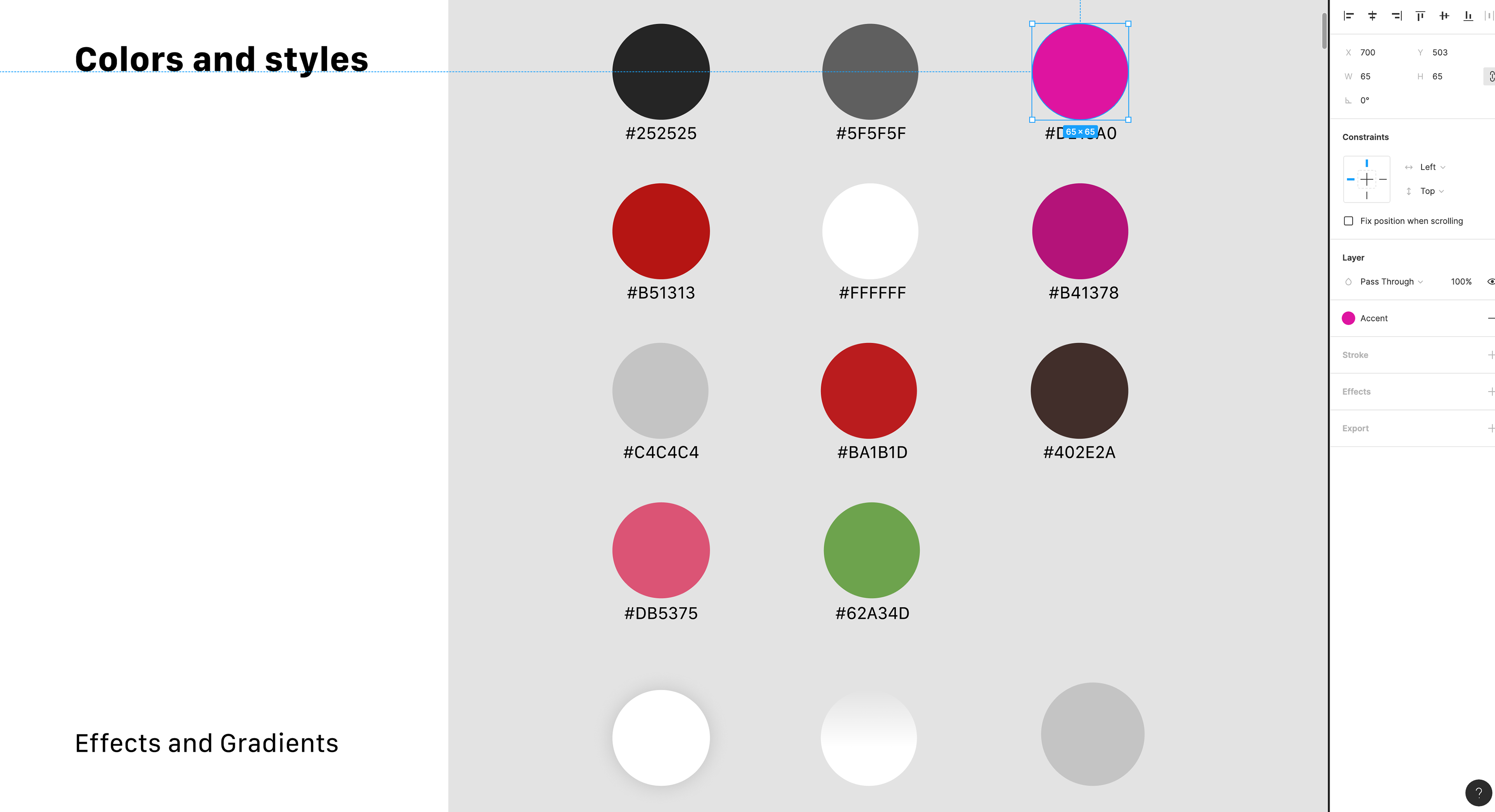
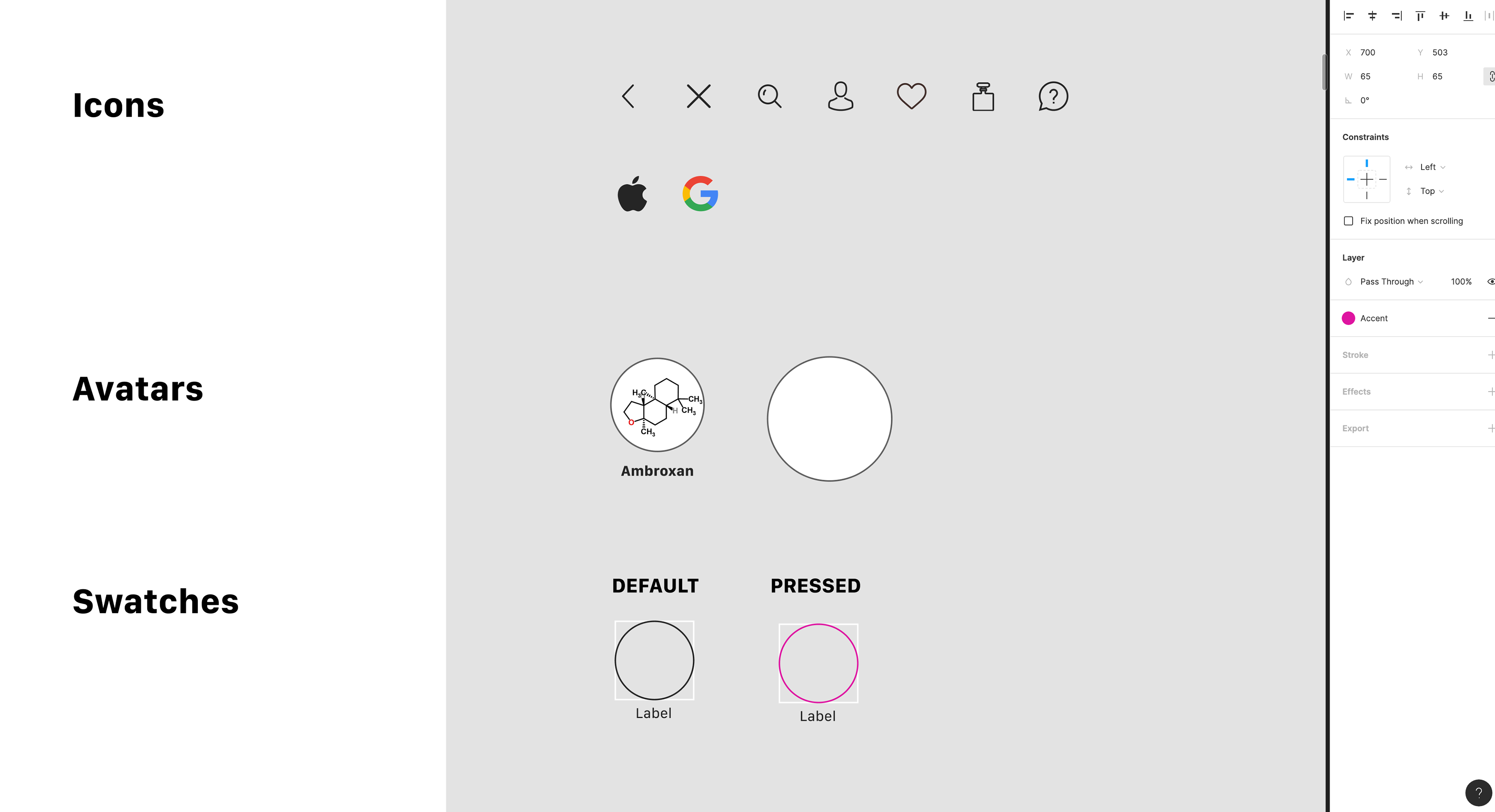
I started by defining my colour palette adding base colours along with one accent I wanted to use as primary colour. I figured out I should call my colour styles abstract names such as "Accent" as I wasn't sure yet what colour I was going to use in the end so a specific name like "Red" or "Magenta" would have been wrong.
I continued adding a Dark and Light style and also any gradients or layer effects such as shadows.
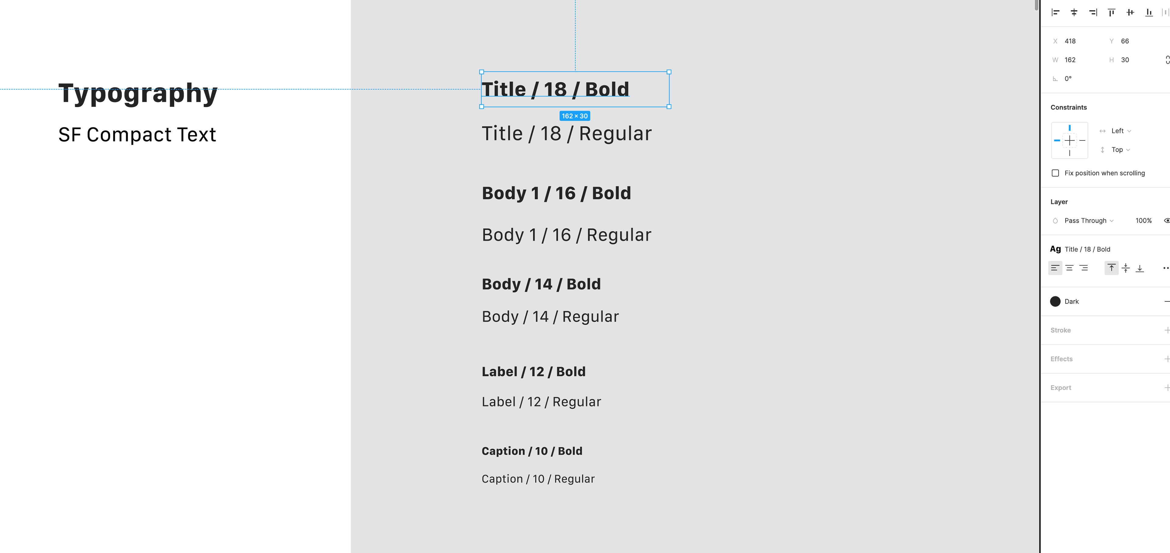
Choosing a type for your project is not easy - but I wanted to keep things simple and efficient so I decided to use System fonts. In my case, San Francisco for iOS.
I used only 5 sizes and only two weights. Figma does not include colour properties in font styles, you can apply colours from your colour palette directly on a font style.
I used only 5 sizes and only two weights. Figma does not include colour properties in font styles, you can apply colours from your colour palette directly on a font style.
I continued working on icons and rest of the "atoms". Having icons looking like they are from the same family is important, so I tried using the same size and thickness.
Starting a library seemed challenging and probably a bit time consuming but after I defined styles and colours it got a bit more easy and organised. I could use the font styles and colour styles to build any component such as, cards, buttons or navigation bars. And I could easily see the impact of any changes to colours and styles reflected across the product.