DURATION: November 2020 - February 2021
TEAM/ROLE: Design team of two/ UX/UI Designer
PROJECT INFO: Client - Handmadeathome - UK marketplace retailer brand focused on handmade items and craft supplies who believes that moving online will expand the business in the Uk and abroad. This is a fictional case study.
PROJECT GOAL: The goal of this project is to design with a mobile first approach a home page for a web e-commerce marketplace where people can buy and businesses can sell handmade items.
TOOLS: Figma
PLATFORM: Web App
THE PROBLEM
Handmadeathome wanted us to find a way to expand the business in the Uk and abroad by moving online. Our team was tasked to design the home screen (mobile, tablet and desktop) for a marketplace platform where people can buy and businesses can sell handmade items.
DEFINING THE PROJECT GOAL
Based on what will achieve the marketplace platform goal - selling handmade products, our client set some priorities for the home screen: logo, search bar, popular products, popular shops, products categories, basket, my account (log in, register), favourites products, products on sale, become a seller.
Before designing we need to understand why the client desires the features listed above and we have set some goals to determine what we need for our research.
First goal is to establish what the users need and the second one is to prioritise features.
RESEARCH
COMPETITORS ANALYSIS
Since this app doesn't exist yet, there is no current experience to evaluate, but to establish what users need and don't need from a marketplace app focused on selling and buying hand made items, we were looking for similar web app competitors.
We choose 6 competitors ( Etsy, Amazon, Aftcra, Artfire, Folsky, Zibbet), apps who have three or more features requested by our client like buy and sell hand made products, product categories.
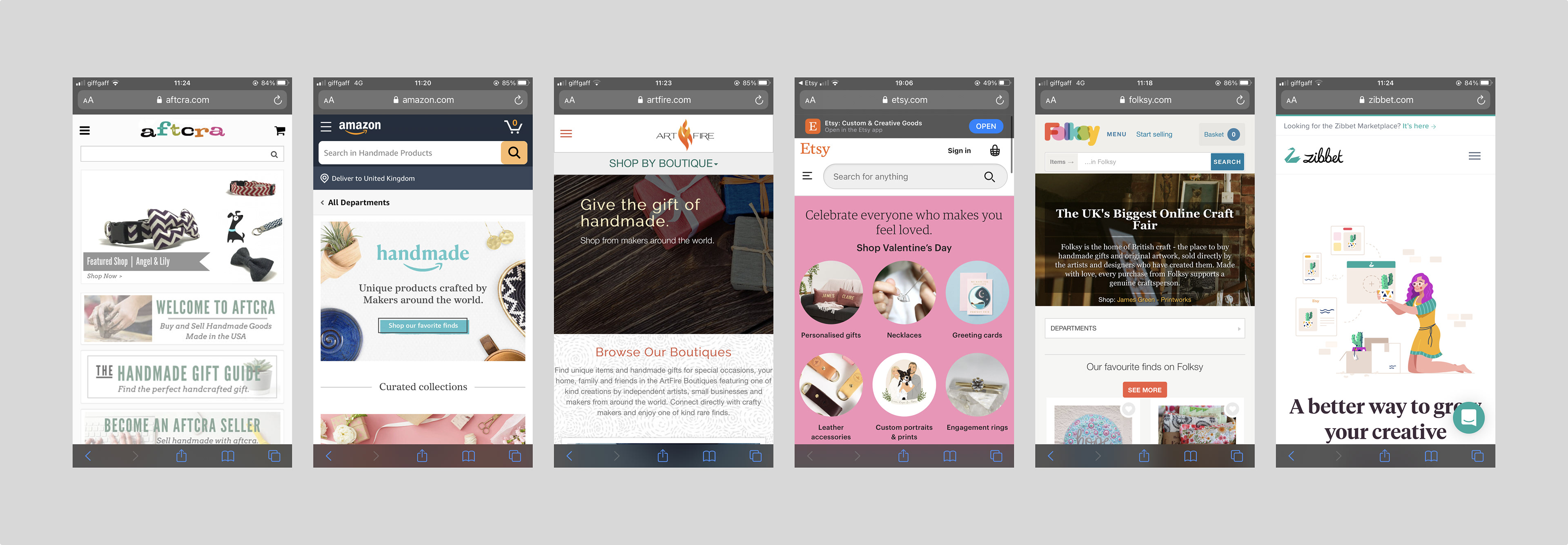
Competitors left to right: Aftcra, Amazon handmade, Artfire, Etsy, Folsky, Zibbet.
USERS INTERVIEWS
We selected participants to test these apps who:
- had used the internet before to buy handmade products
- are in love with hand made products
- own a small business with a focus on handmade products
- are looking to move the business online
We wanted to evaluate how well competitors give users the content they needed and what kind of device users prefer.
We gave users some tasks to complete:
- choose the device to enter the app
- go to the home screen
- register
- search the product/products you are looking for
- find the product/products if you don’t know exactly what you want
- add to favourites products you like
- search how to sell your own products
All these questions were around the Discovery phase and users were able to express what device they prefer, what went good and what could be improved around these journeys.
RELEVANT FINDINGS
72,5 % testers - used smartphones - mobile first design will be our approach for design.
From our competitors I've learned:
Pros - easy to find the product they are looking for (search form, category)
- easy to register
Cons - users are struggling when they are looking to apply for selling their own products
- users are confused when they don’t know exactly what to buy (suggestion)
- users can't add their favourites products
DEVISE USER PERSONA
To have a clear vision about our user, I created user persona "Anna".
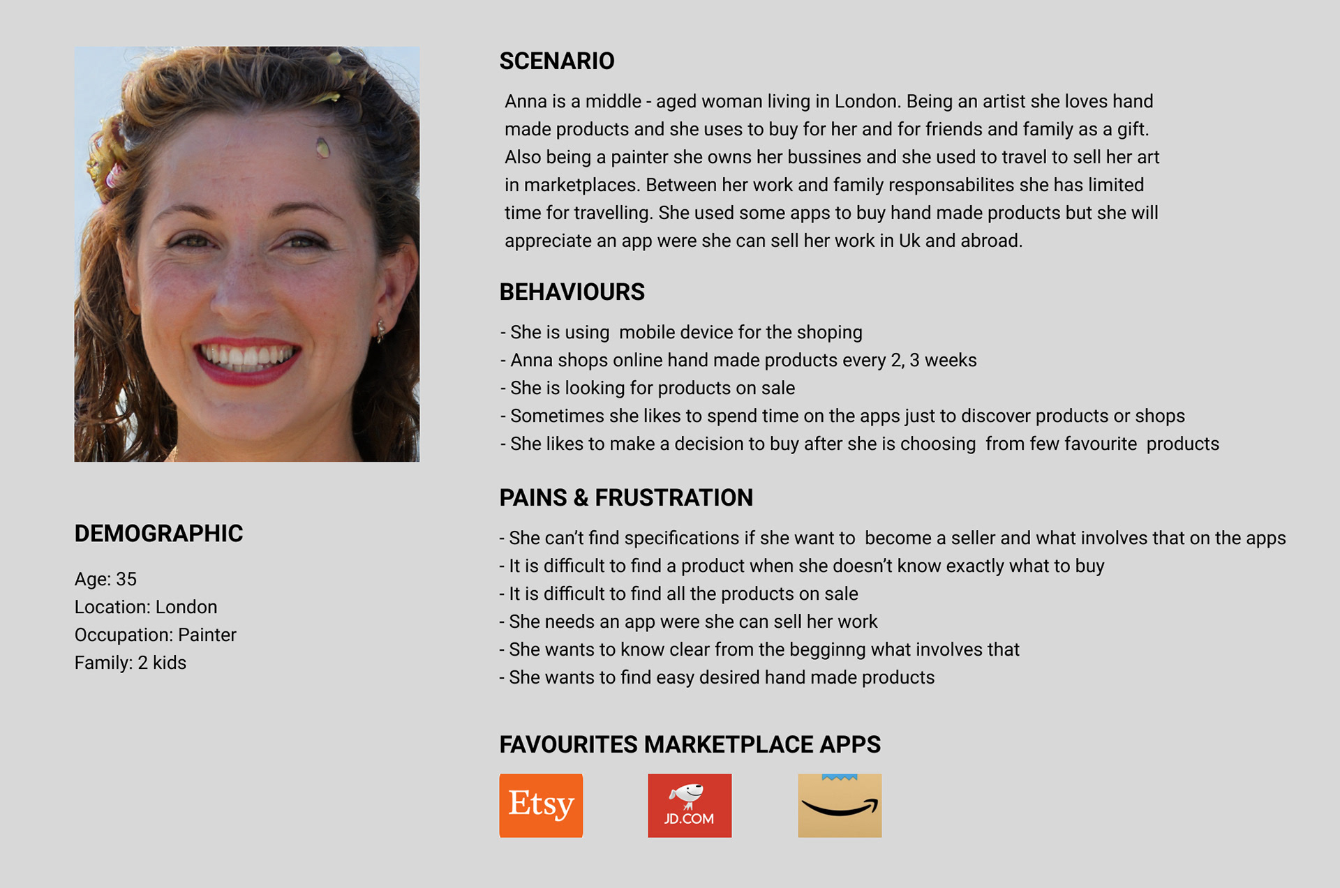
User persona
PRIORITISE FEATURES
Considering Anna’s needs and frustrations and business needs we have to prioritise app features. When it comes to mobile-first design, content is the key. Thinking mobile doesn’t mean to eliminate information, it means sorting information, what our users need the most.
Prioritisation technique used to reach a common understanding (must, should, could, will not).
Must have: Sign in /Register, Apply to sell
Should have: Favourites, Products category
Could have: Sale, Popular products
Will not have: Native app
DESIGN
INITIALS WIREFRAMES
After forming our research findings and being inspired by some of the tester’s favourite marketplace apps we created five wireframes variants. Because our approach is mobile first, we will start with the mobile home screen.

Inspired design apps left to right: Etsy, JD, Amazon handmade
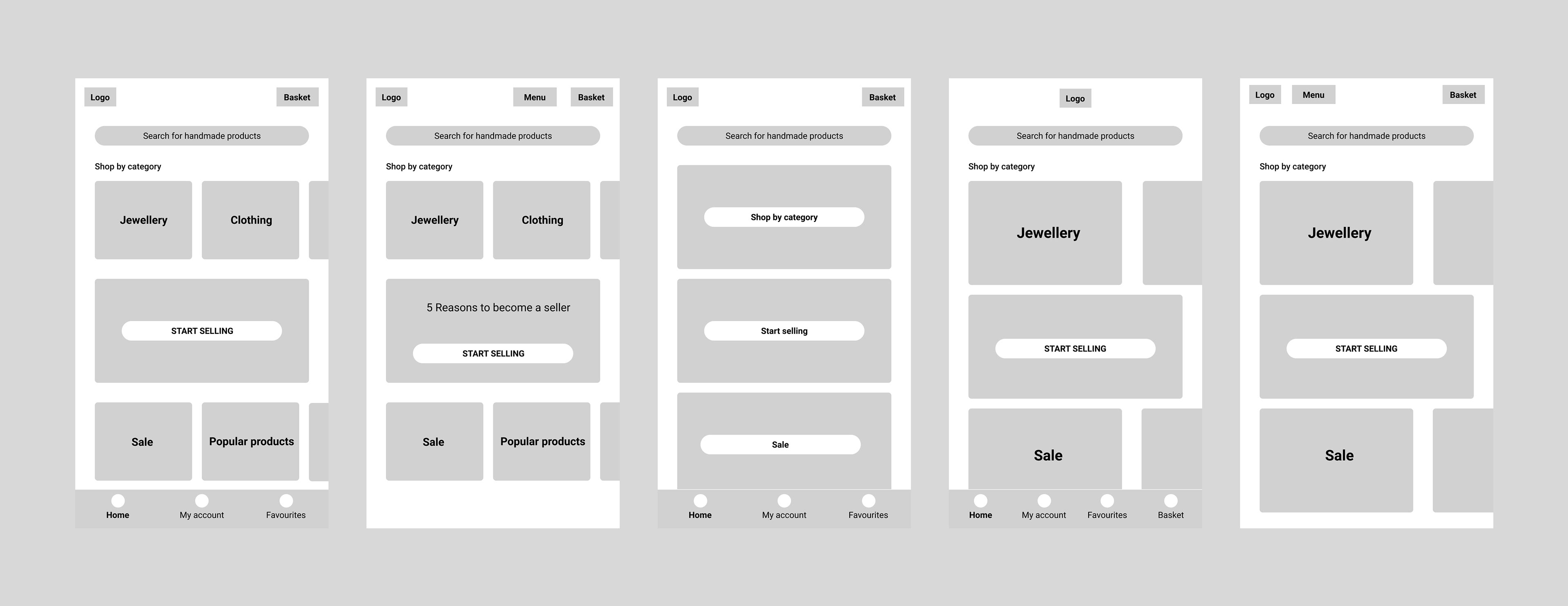
Home screens wireframes variants
FEEDBACK SESSION ON INITIAL IDEAS
We held a feedback session with our client and design team to determine which wireframe to move forward with. Our design will give users solid solutions to problems they experience. Having in mind what the users want to do when they visit our app, what is their goal, how will we meet that need with our design, how will the user react?
Screens that delighted:
- register quickly
- find easy a product through categories
- add products to favourites
- find easy products on sale
- find helpful the "popular products" card
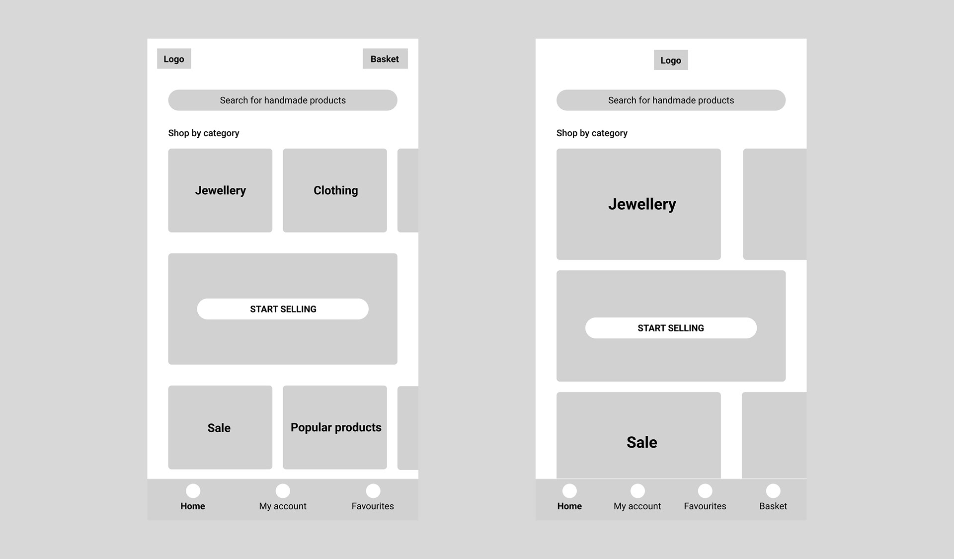
Screens that disappointed:
- confused with the "start selling" card
- find hard to register through the menu bar
- find hard to discover were is the favourites section through the menu bar
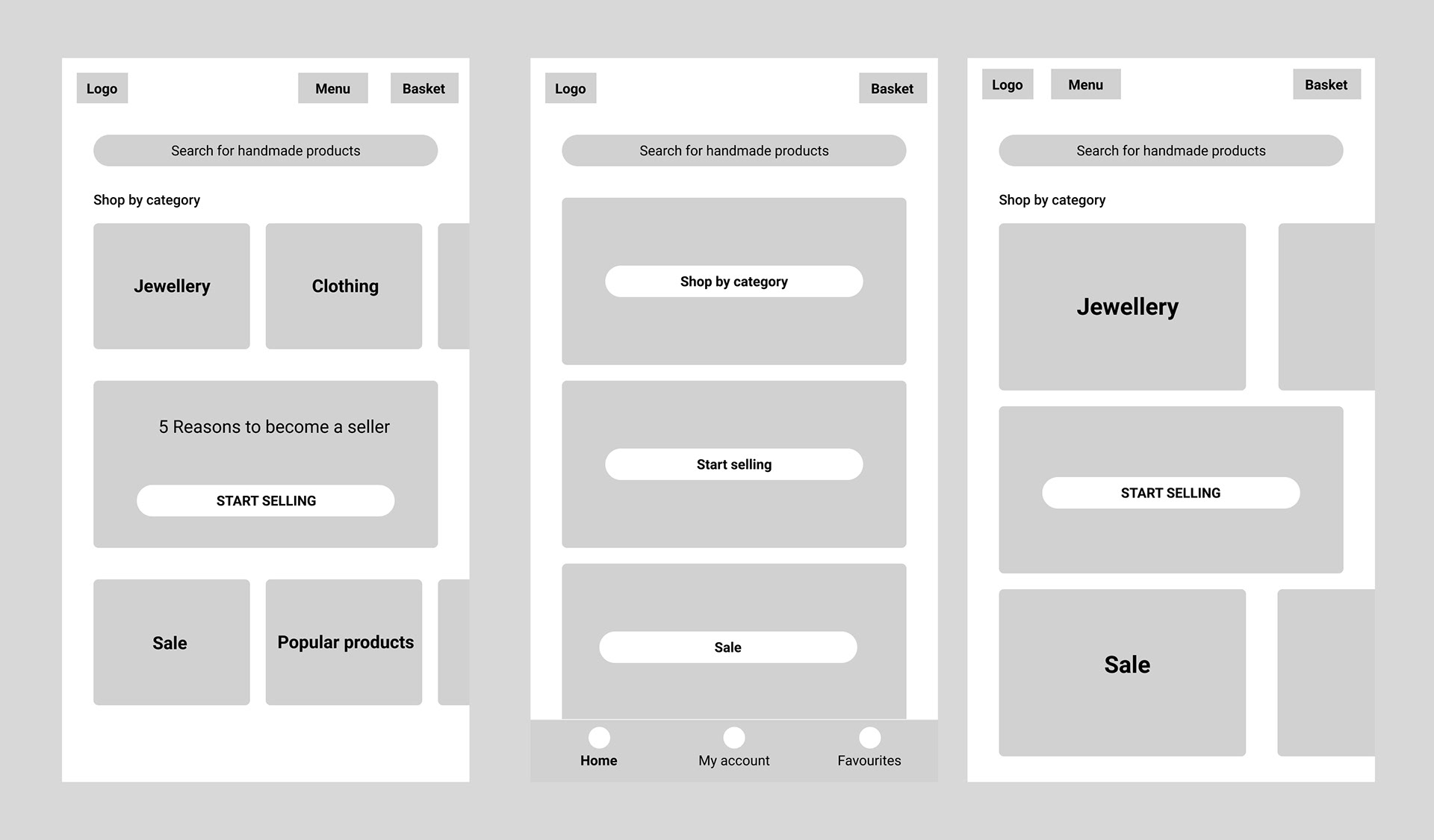
Considering this informations, we decided that the home screen will not have a menu bar and we will be more explicit about the “Start selling“ card.
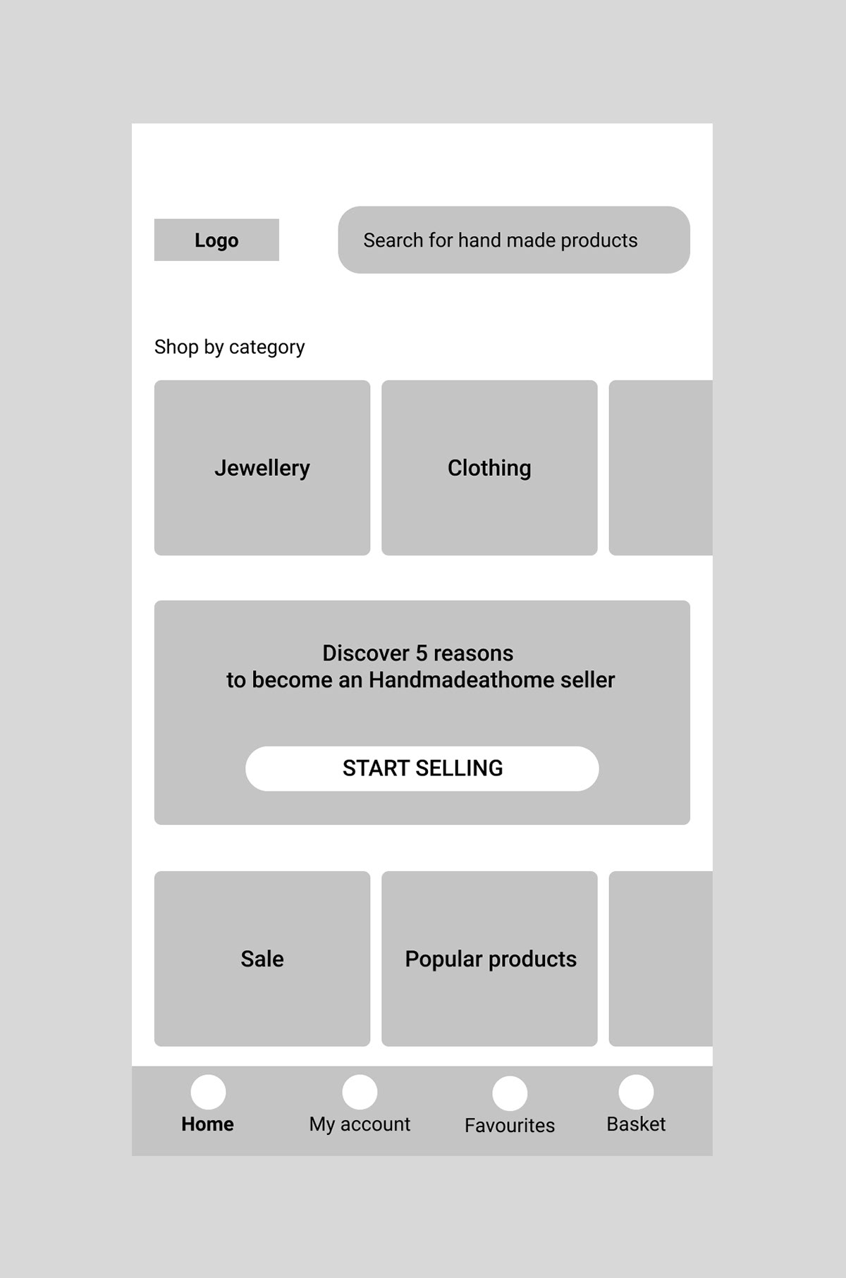
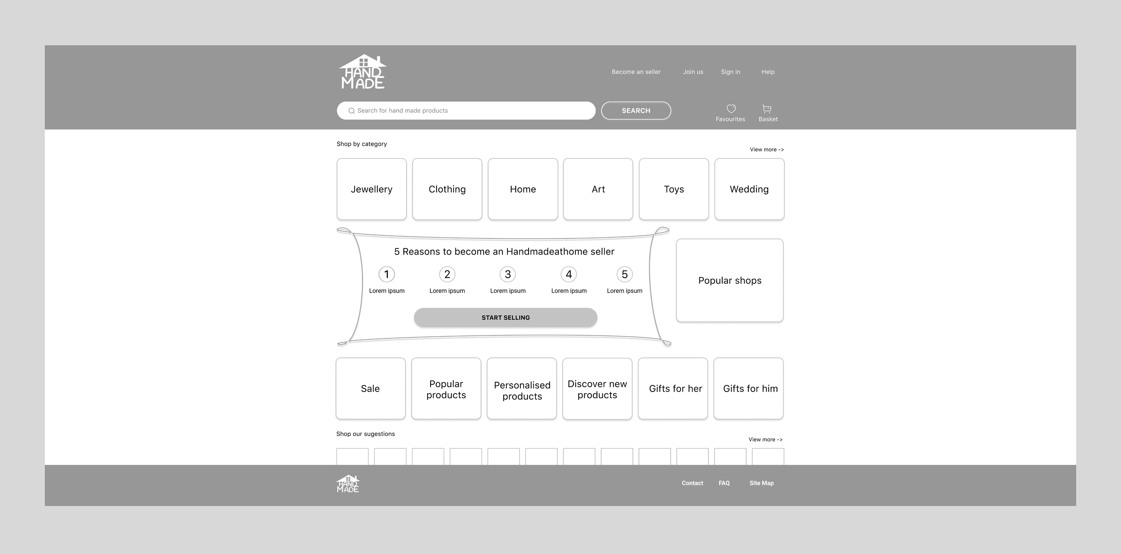
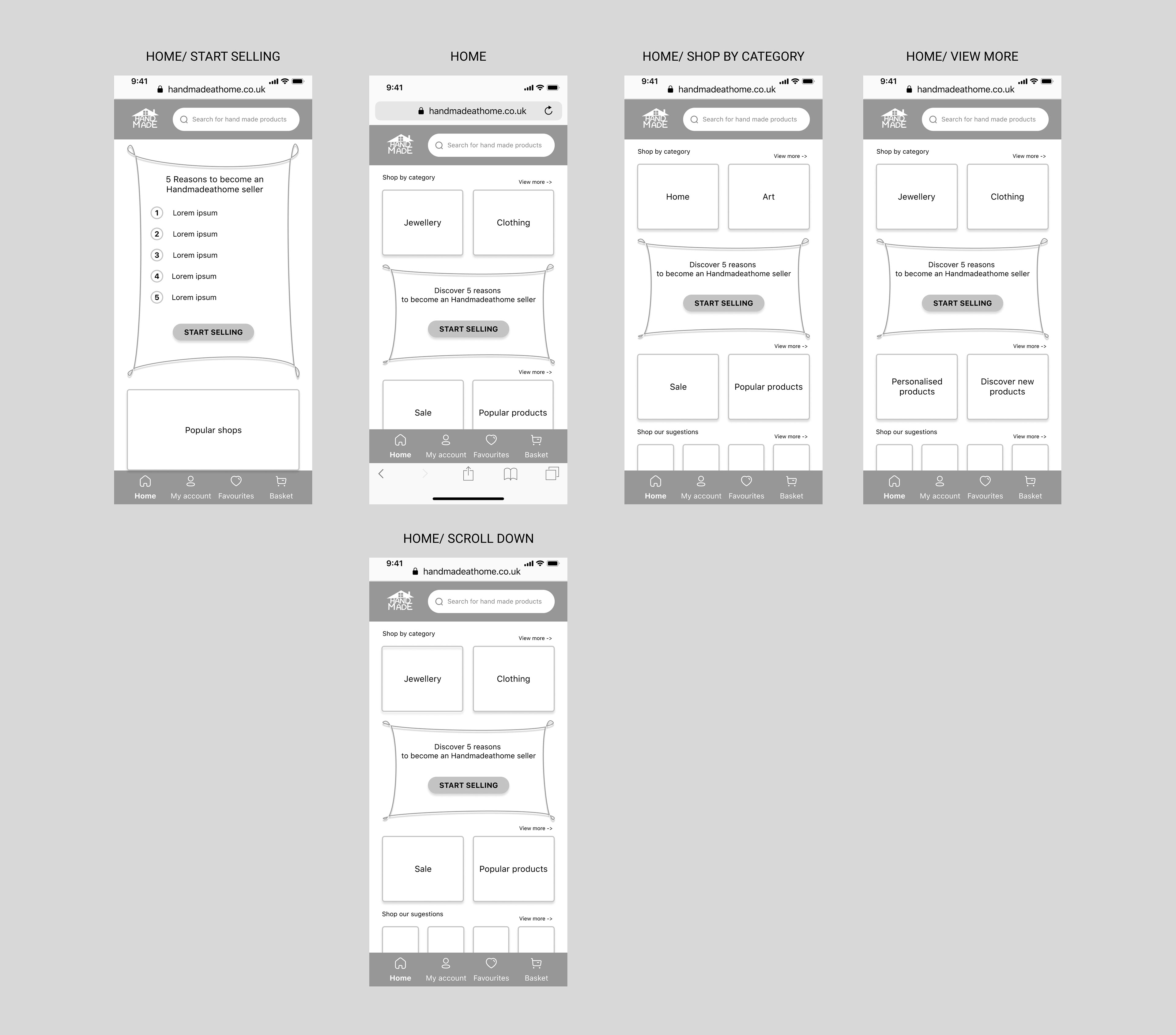
FINAL WIREFRAMES
MOBILE HOME SCREEN
TABLET HOME SCREEN
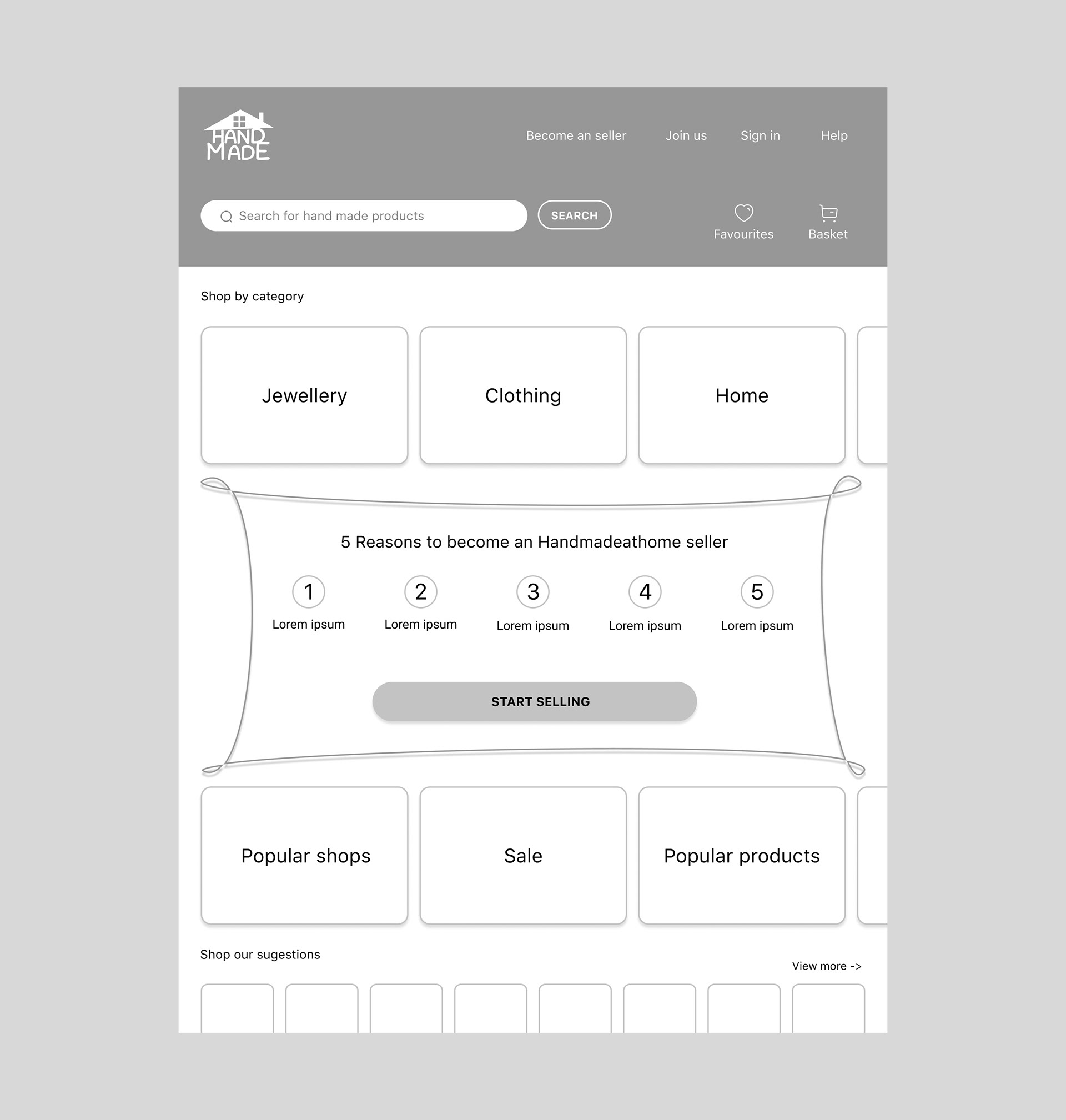
DESKTOP HOME SCREEN